Case Study
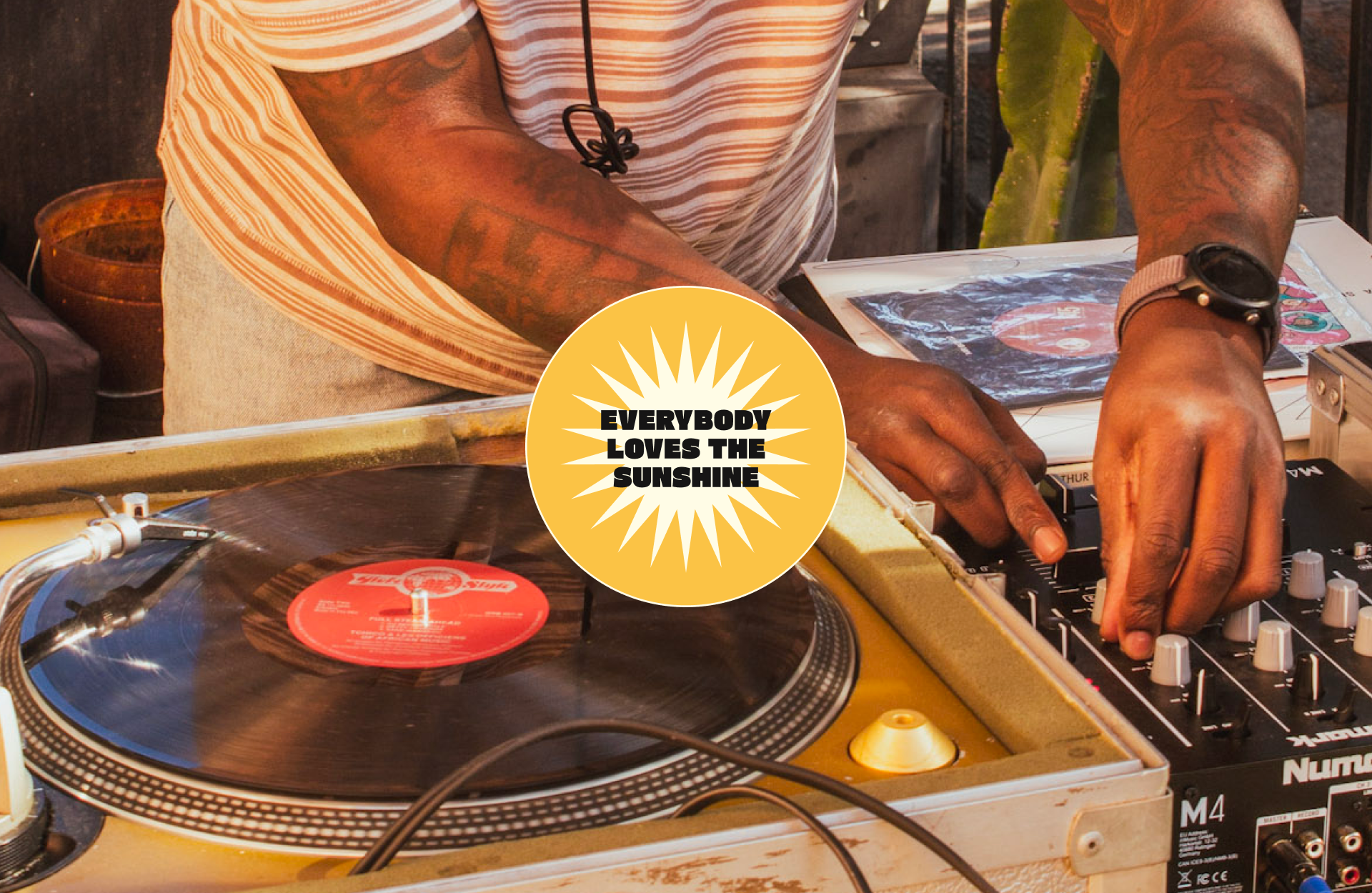
everybody loves the sunshine
Everybody Loves the Sunshine is a monthly day party I produce in partnership with Los Angeles tennis boutique Grand Slam. The party's intention is to create conversation and community through music, showcasing local DJs and food/beverage vendors and inviting the community to shake hands with neighbors and get on the dance floor.
Branding
Creative Direction
Content Strategy
Digital Design
Experiential
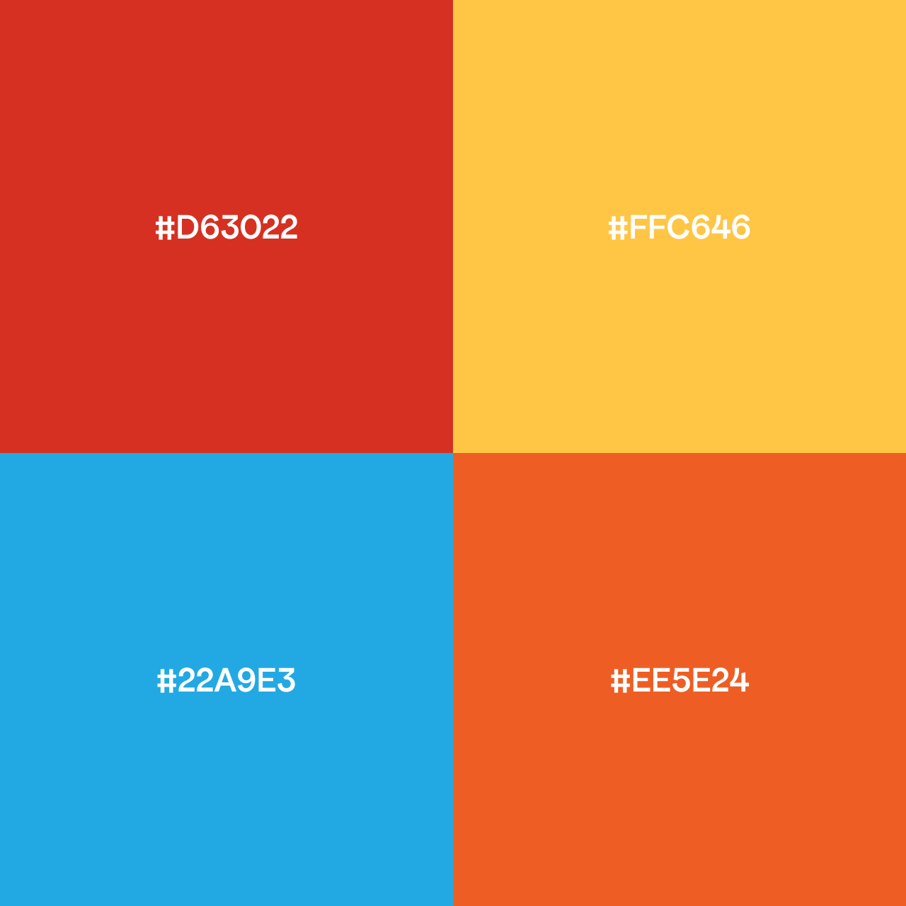
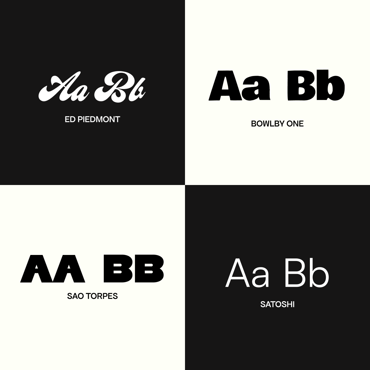
Color Palette and Typograhy Selection
branding: intention , tone of voice, and aesthetics
The catalyst for this party was seeing a need for a daytime, music-centered third space in our neighborhood, one without an entry fee or feeling of exclusivity. Los Angeles has a reputation for being a city that can be hard to build community in, so we wanted to provide a free space that showcases DJs who play different kinds of music and therefore draw different crowds.
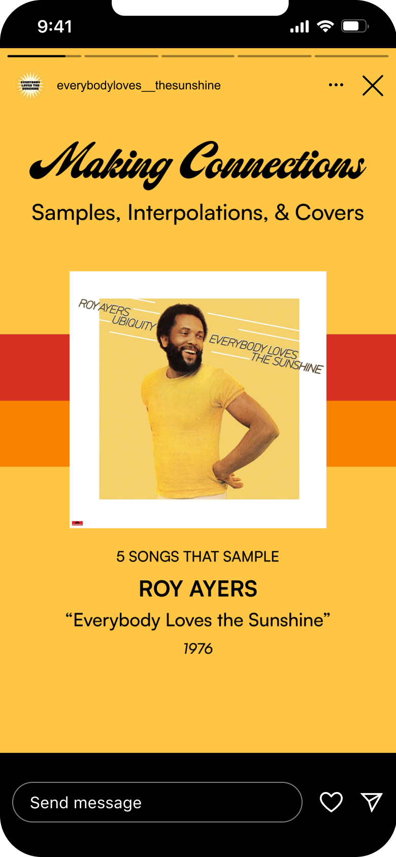
The event's name, an ode to the classic Roy Ayers song, mirrors the warm and universal character we want people to feel when they attend. It's also a nod to the music lovers, who enjoy learning about music new and old, and the sunny city we all call home.
These elements were brought into the branding, which has a flexible, bold color palette and collection of typefaces. Given all of the different collateral, I did not want to constrict the look and feel but I also wanted it to be honed and consistent. I selected four key colors we would place against black and white, as well as four typefaces to swap throughout our promotional and digital assets.
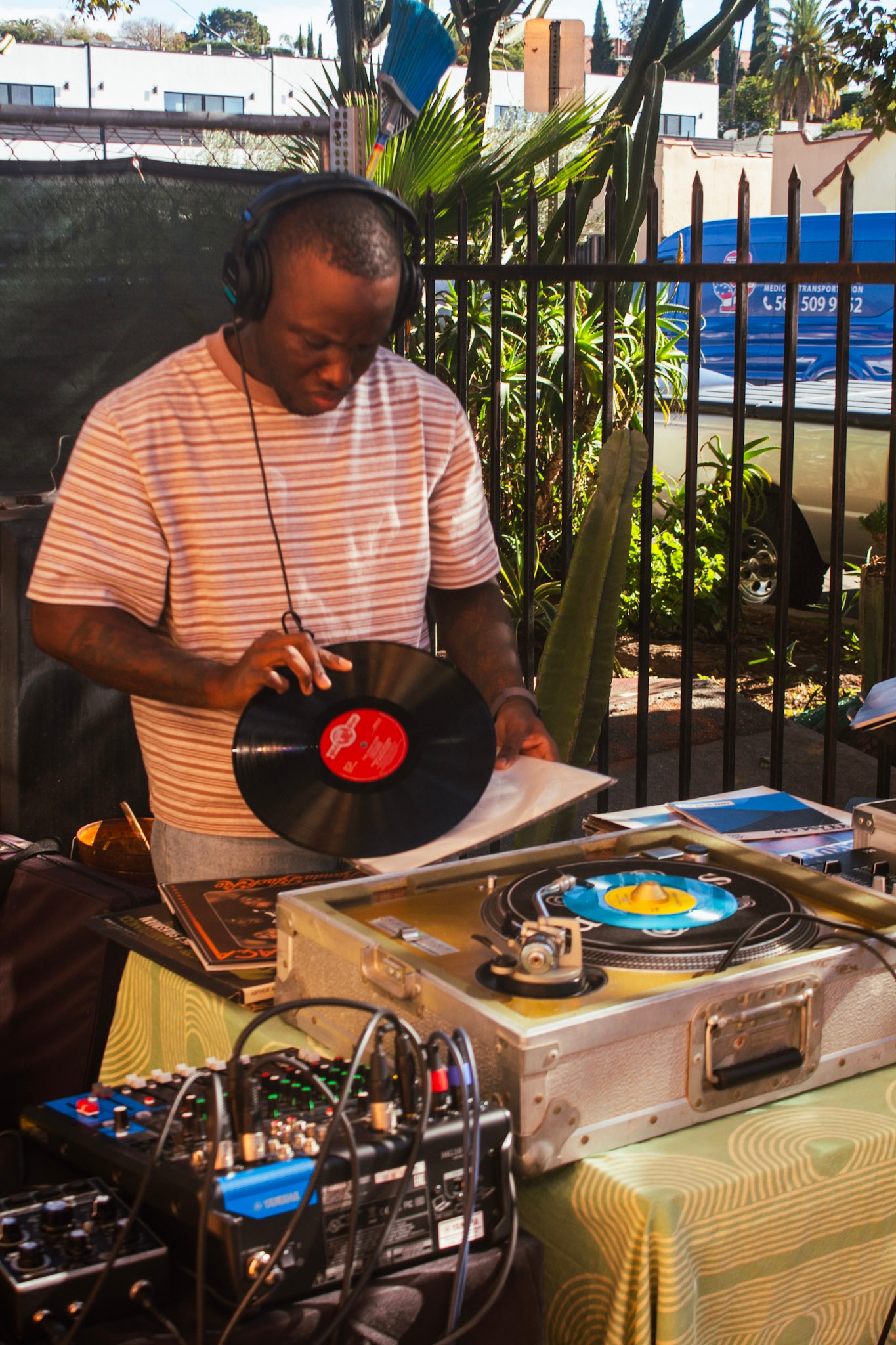
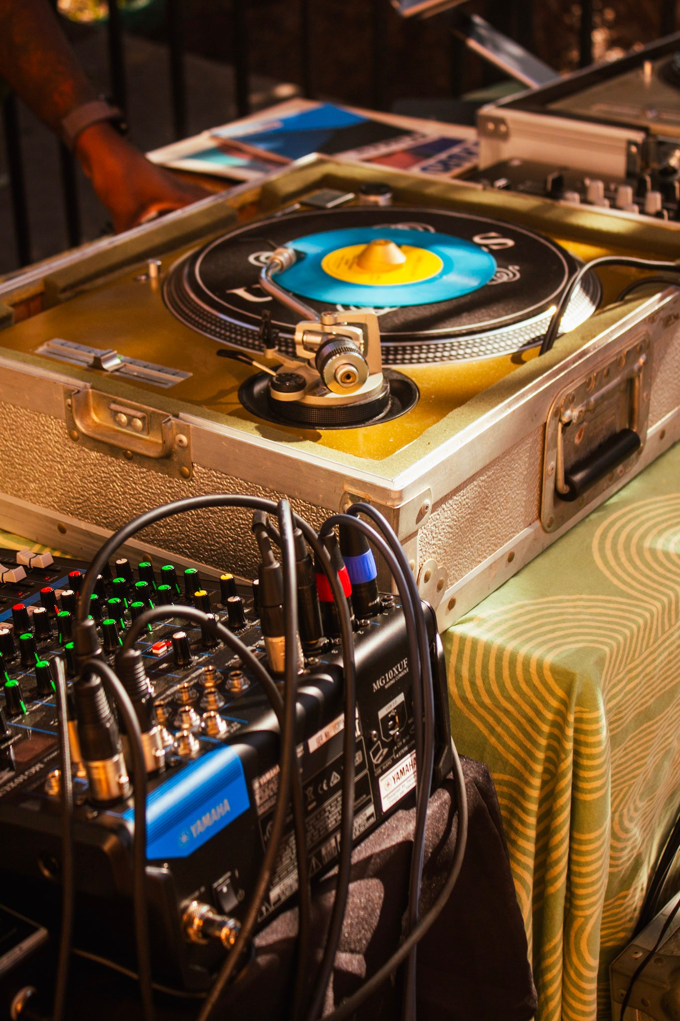
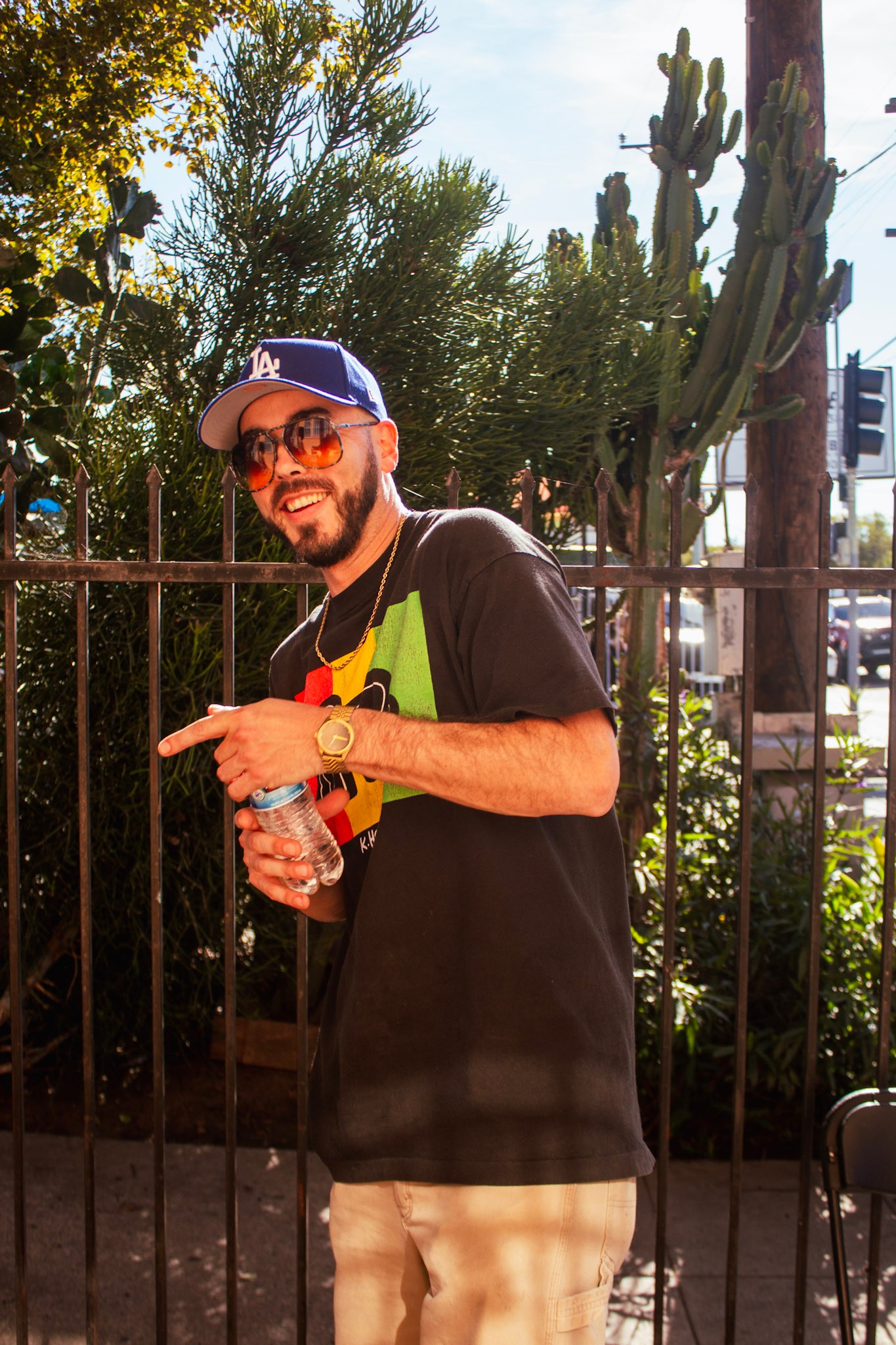
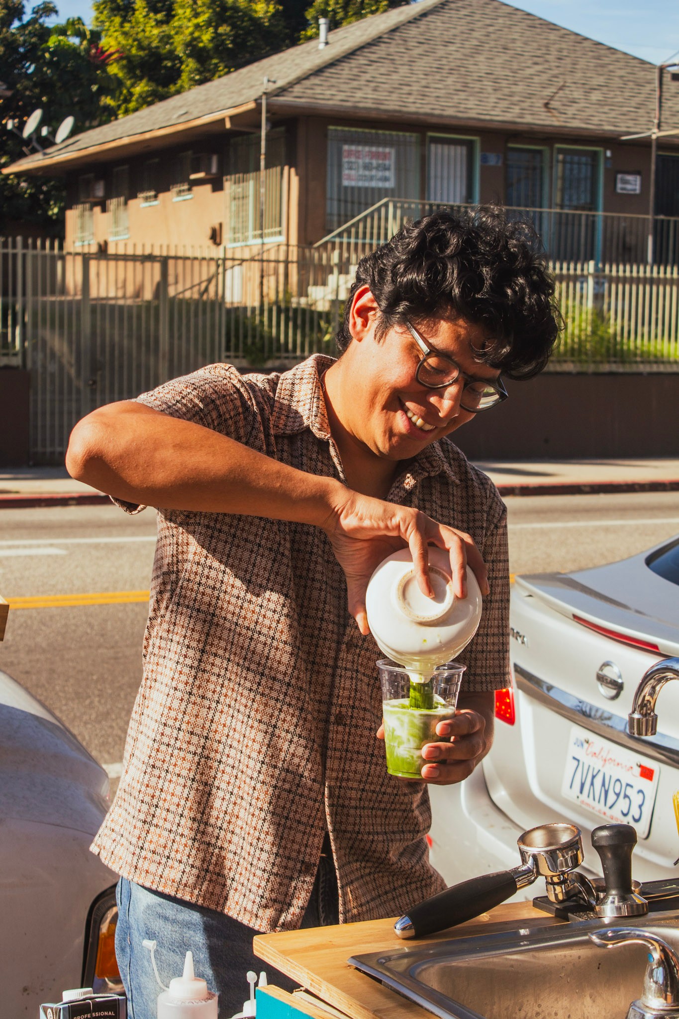
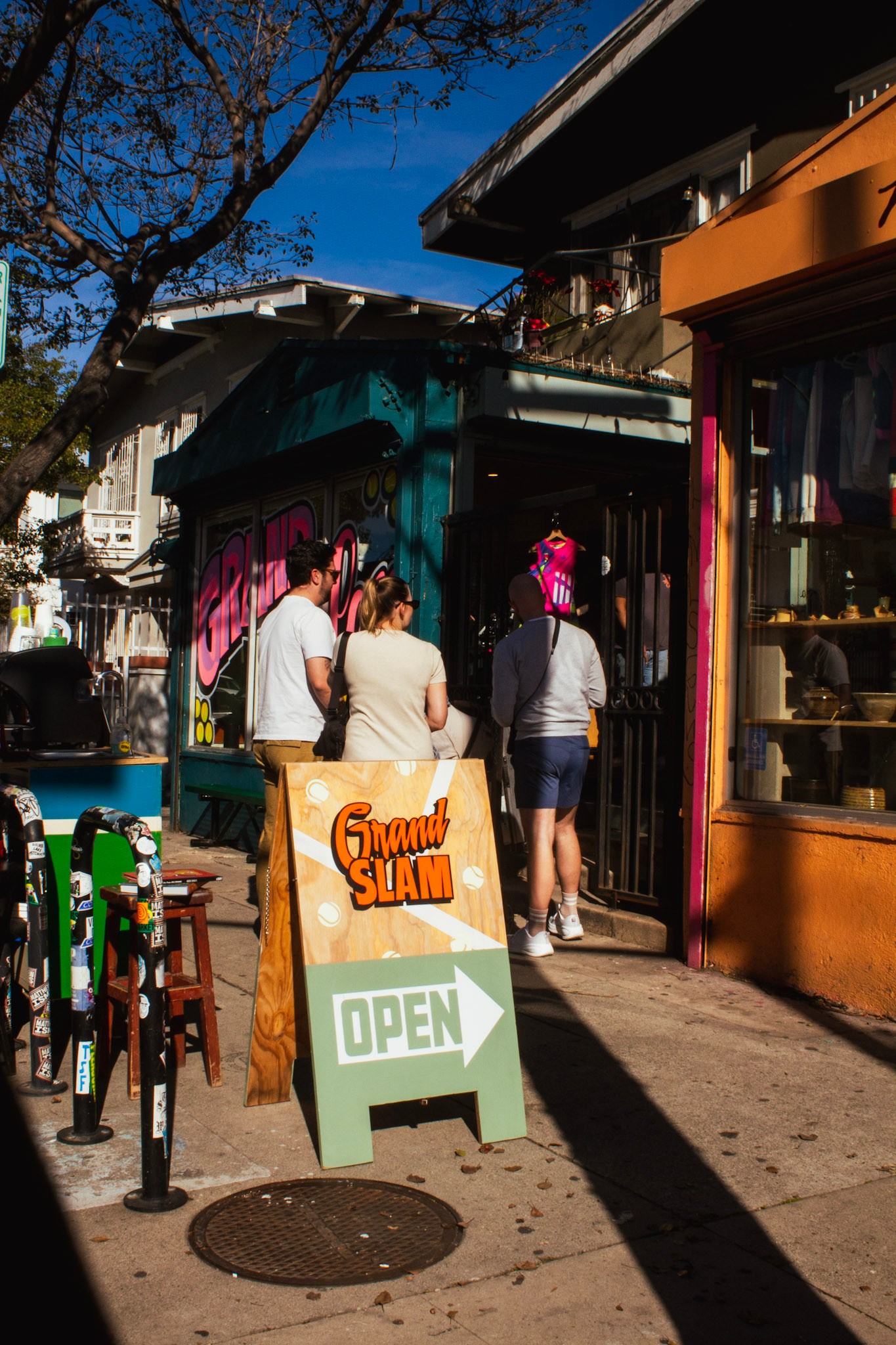
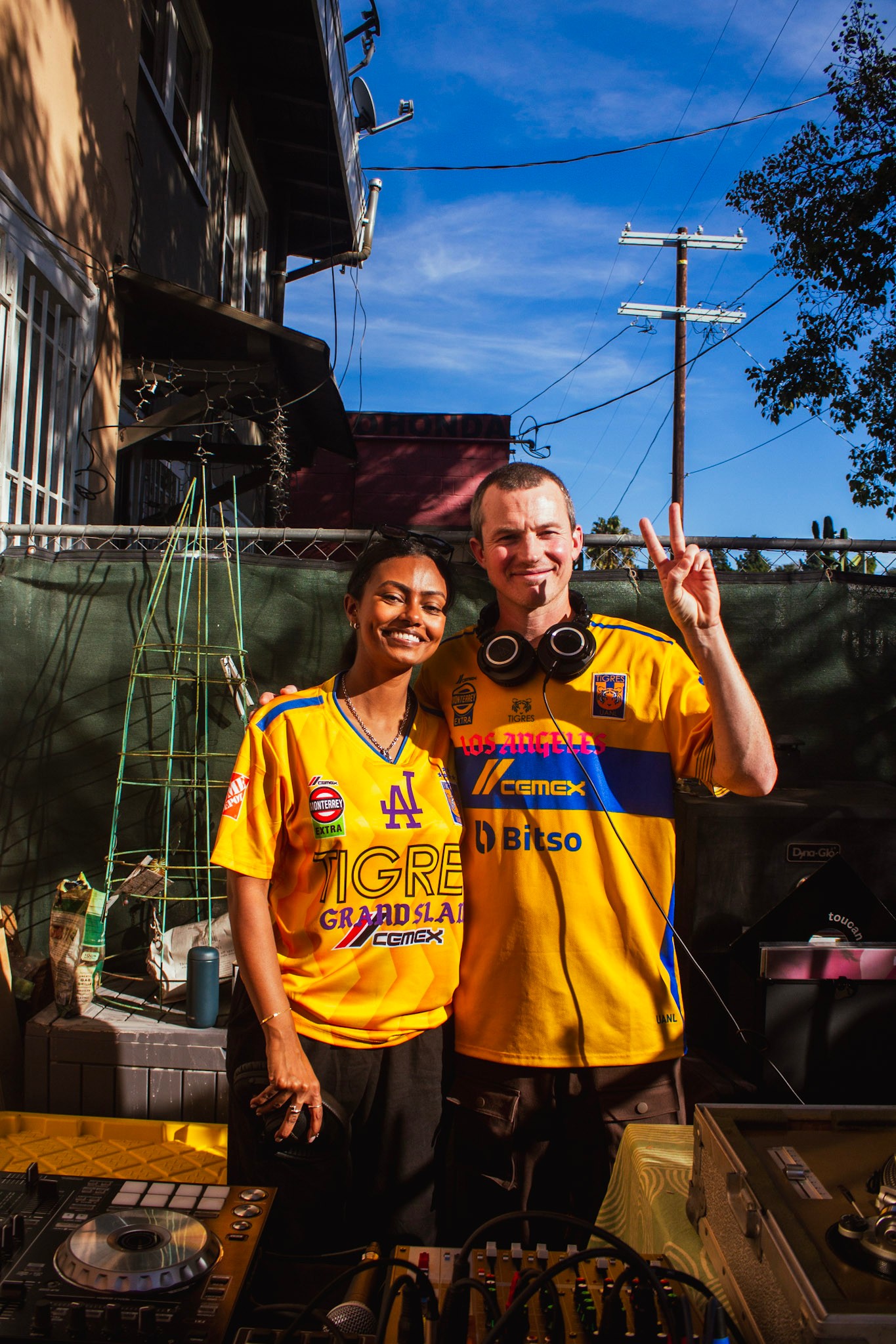
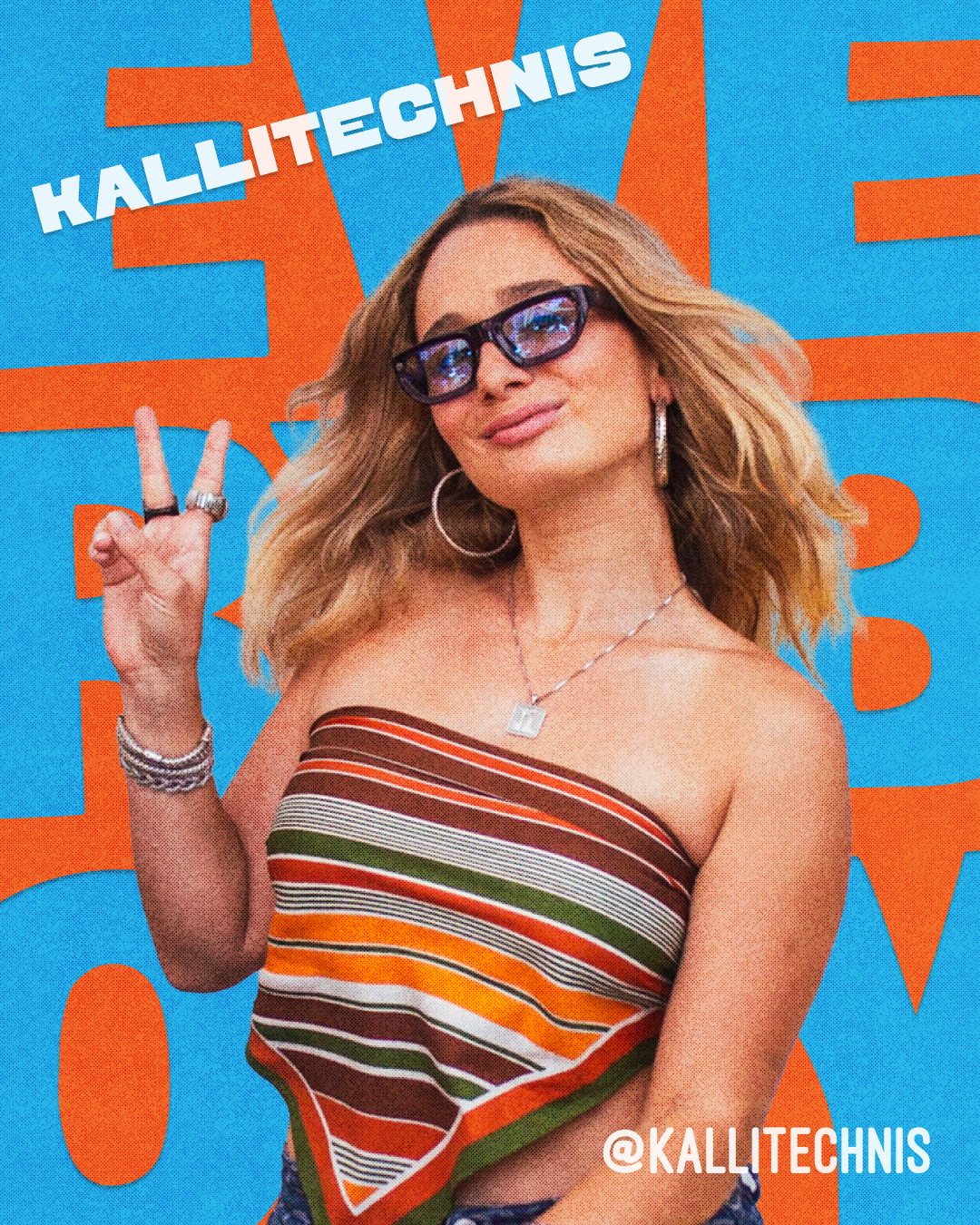
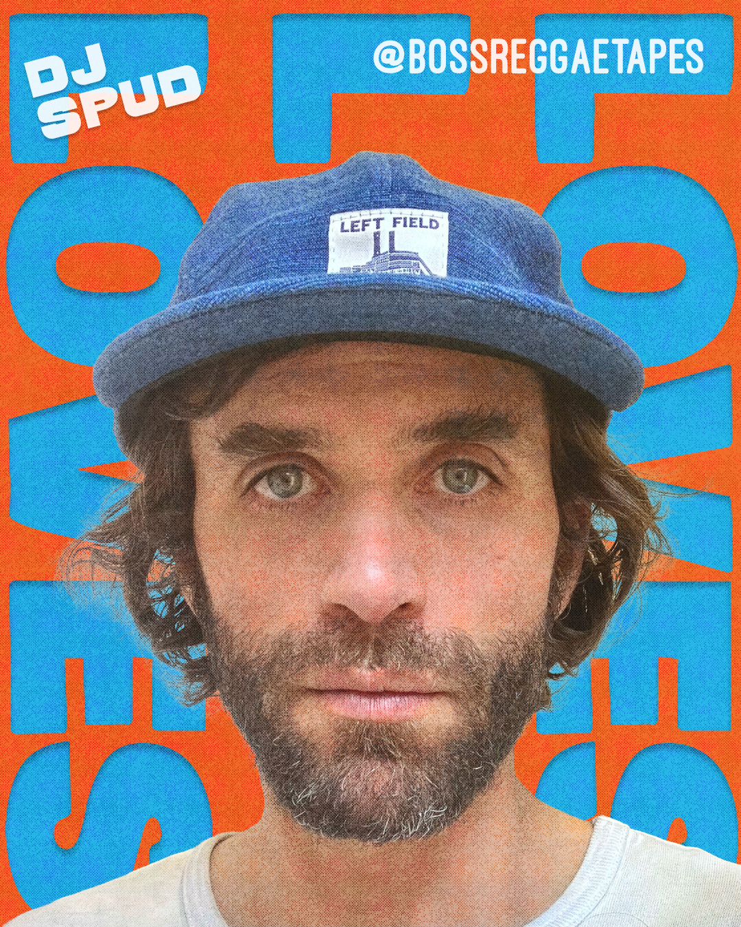
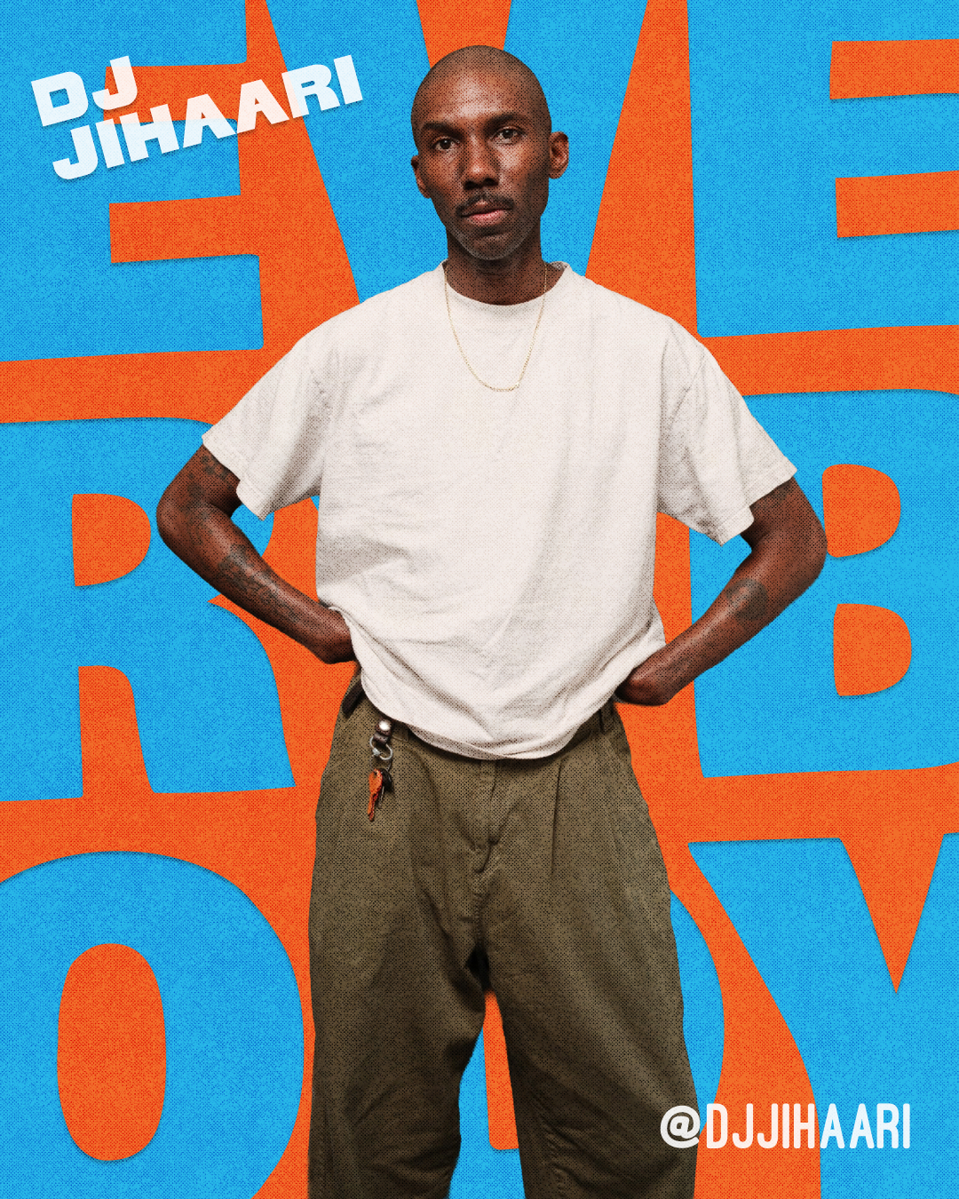
Creative Direction / Photographs by Marlon Antunez (@marlong)
creative direction
Warmth and nostalgia are the key words for the event’s aesthetic in terms of photography, marketing materials, and social media assets.
The world we are building through our photography always traces back to the event’s wholesome, upbeat, and inclusive tone.
Our digital presence aims to feel just as vibrant, fun, and inviting. The content we share values timelessness over trends, featuring interviews with creatives about the music that’s shaped them, educational videos and carousels about music history, reels of our event attendees enjoying themselves, and hand-curated playlists.
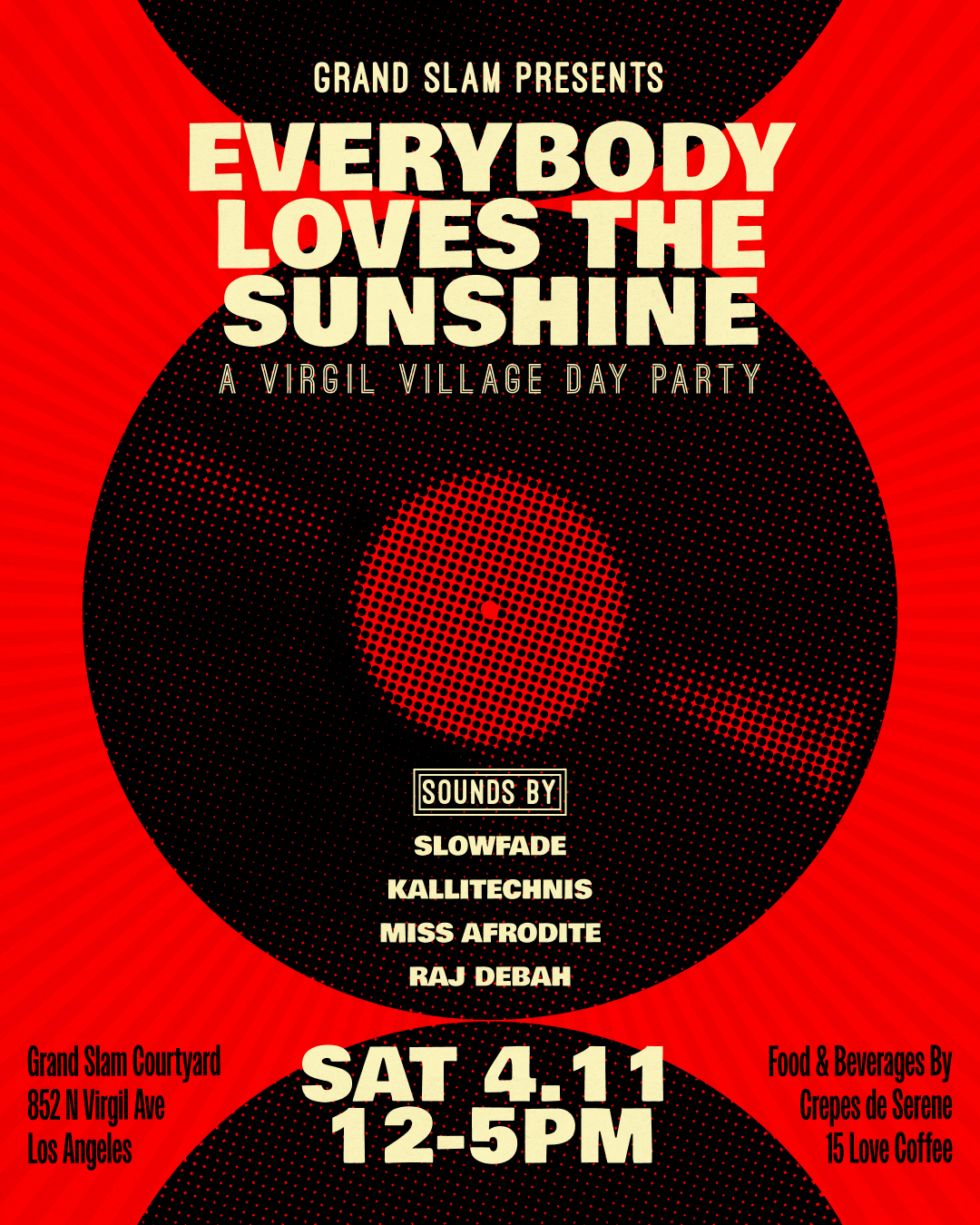
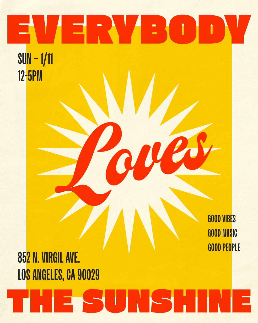
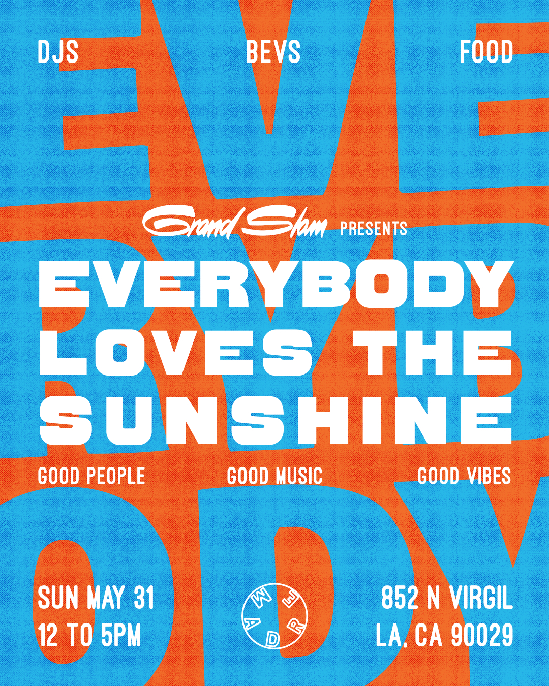
Flyers and Promotional Design Assets
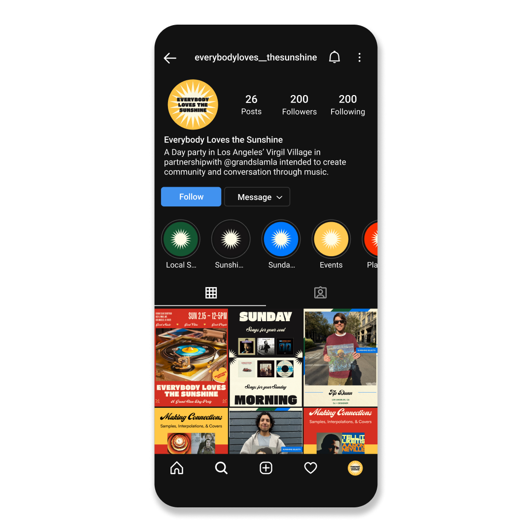
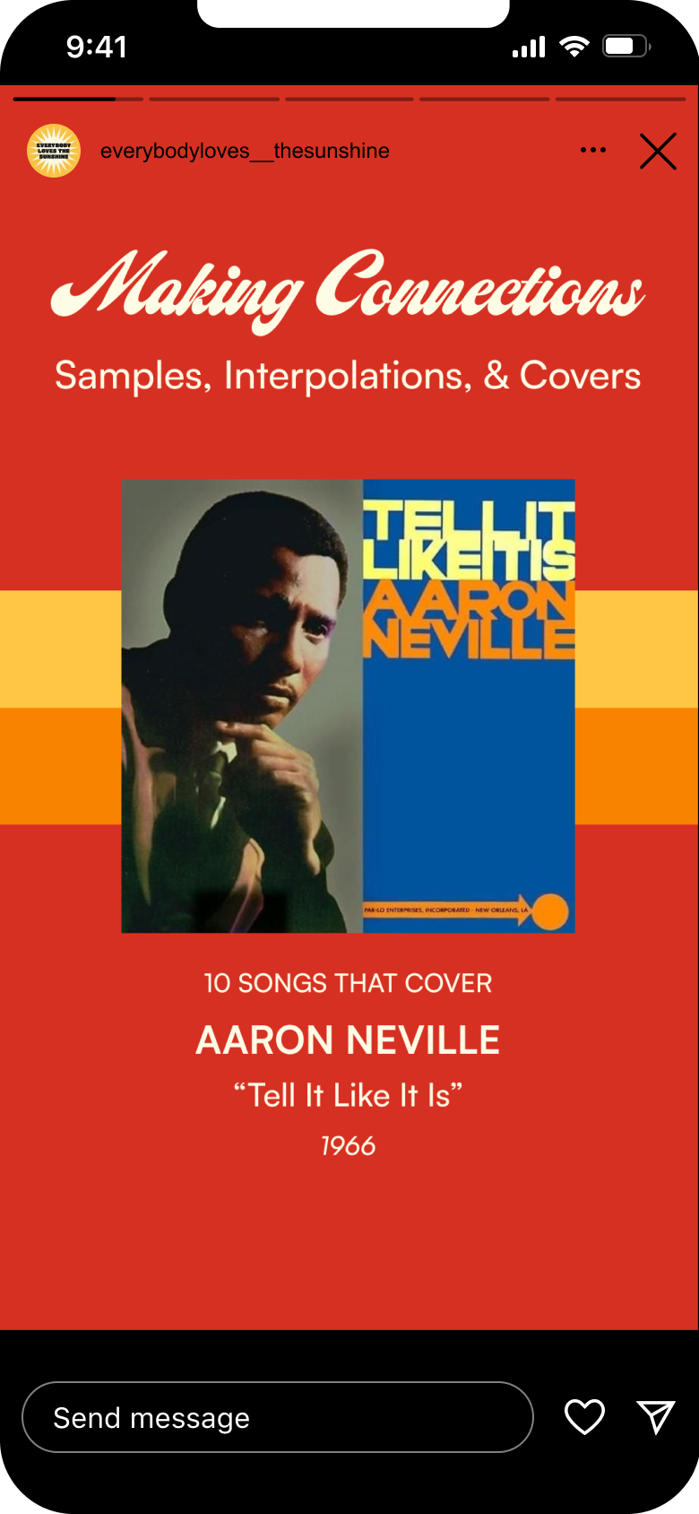
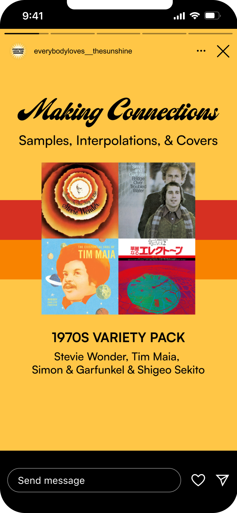
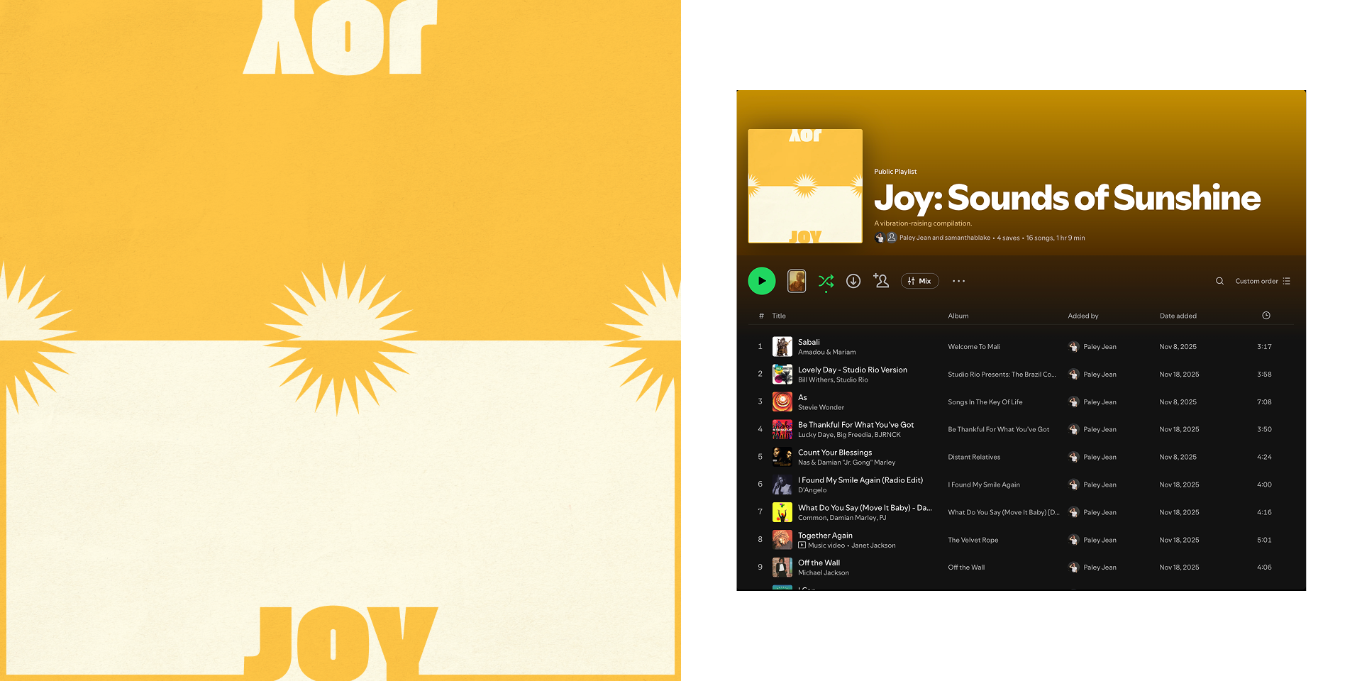
Instagram Overview, Social Media Assets (Instagram), Playlist Asset
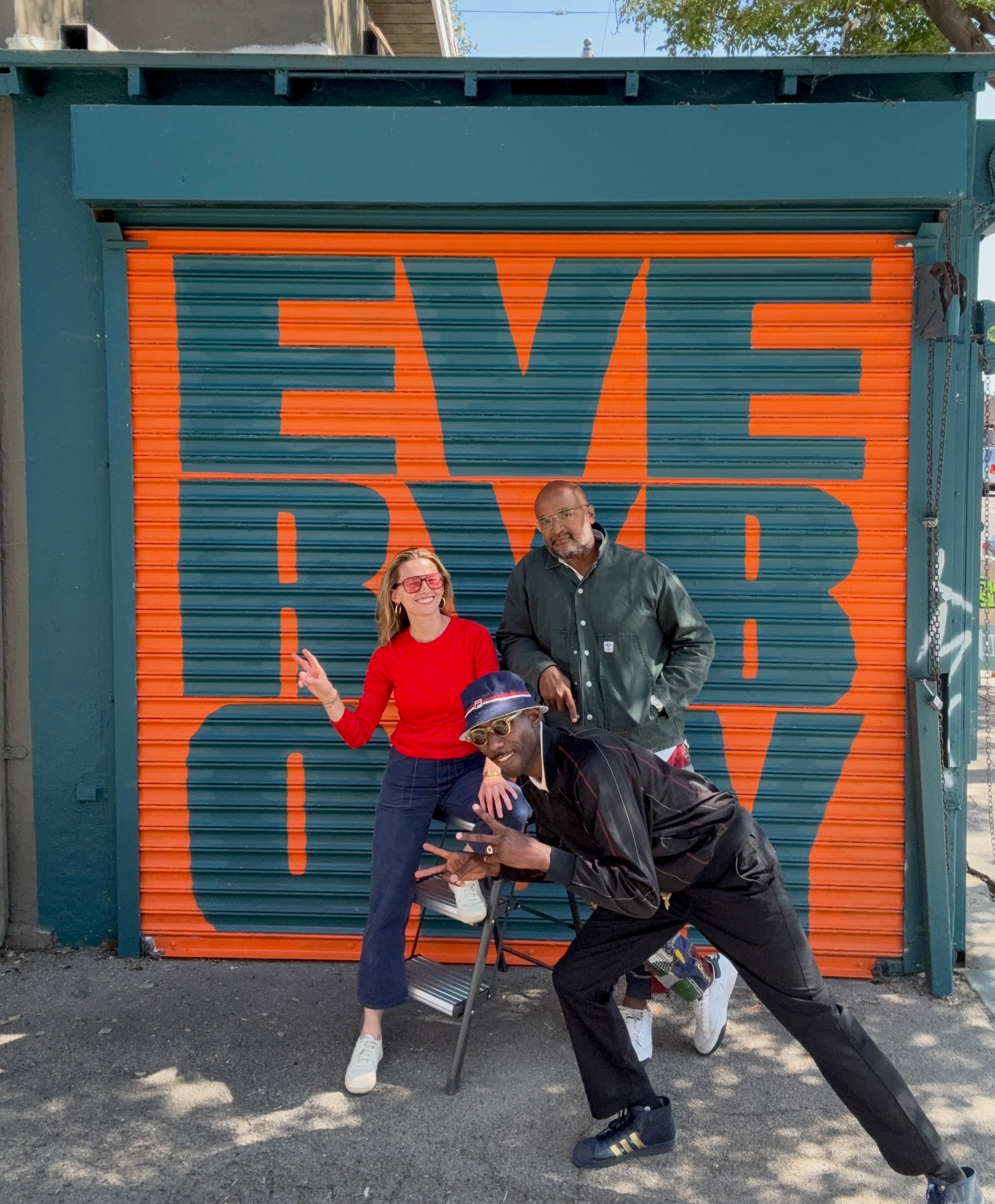
A Mural Wall we Recently Painted
conclusion
As we move forward with this event, we always want to keep community at the center of it. Above is an image of a recent mural we painted, stressing our commitment to have Everybody feel like a part of the movement.

i’d love to hear from you!
paleymartindesign@gmail.com
Case Study
everybody loves the sunshine
Everybody Loves the Sunshine is a monthly day party I produce in partnership with Los Angeles tennis boutique Grand Slam. The party's intention is to create conversation and community through music, showcasing local DJs and food/beverage vendors and inviting the community to shake hands with neighbors and get on the dance floor.
Branding
Creative Direction
Content Strategy
Digital Design
Experiential
Color Palette and Typograhy Selection
branding: intention , tone of voice, and aesthetics
The catalyst for this party was seeing a need for a daytime, music-centered third space in our neighborhood, one without an entry fee or feeling of exclusivity. Los Angeles has a reputation for being a city that can be hard to build community in, so we wanted to provide a free space that showcases DJs who play different kinds of music and therefore draw different crowds.
The event's name, an ode to the classic Roy Ayers song, mirrors the warm and universal character we want people to feel when they attend. It's also a nod to the music lovers, who enjoy learning about music new and old, and the sunny city we all call home.
These elements were brought into the branding, which has a flexible, bold color palette and collection of typefaces. Given all of the different collateral, I did not want to constrict the look and feel but I also wanted it to be honed and consistent. I selected four key colors we would place against black and white, as well as four typefaces to swap throughout our promotional and digital assets.
Creative Direction / Photographs by Marlon Antunez (@marlong)
creative direction
Warmth and nostalgia are the key words for the event’s aesthetic in terms of photography, marketing materials, and social media assets.
The world we are building through our photography always traces back to the event’s wholesome, upbeat, and inclusive tone.
Our digital presence aims to feel just as vibrant, fun, and inviting. The content we share values timelessness over trends, featuring interviews with creatives about the music that’s shaped them, educational videos and carousels about music history, reels of our event attendees enjoying themselves, and hand-curated playlists.
Flyers and Promotional Design Assets
Instagram Overview, Social Media Assets (Instagram), Playlist Asset
A Mural Wall we Recently Painted
conclusion
As we move forward with this event, we always want to keep community at the center of it. Above is an image of a recent mural we painted, stressing our commitment to have Everybody feel like a part of the movement.

i’d love to hear from you!
paleymartindesign@gmail.comCase Study
everybody loves the sunshine
Everybody Loves the Sunshine is a monthly day party I produce in partnership with Los Angeles tennis boutique Grand Slam. The party's intention is to create conversation and community through music, showcasing local DJs and food/beverage vendors and inviting the community to shake hands with neighbors and get on the dance floor.
Branding
Creative Direction
Content Strategy
Digital Design
Experiential
Color Palette and Typograhy Selection
branding: intention , tone of voice, and aesthetics
The catalyst for this party was seeing a need for a daytime, music-centered third space in our neighborhood, one without an entry fee or feeling of exclusivity. Los Angeles has a reputation for being a city that can be hard to build community in, so we wanted to provide a free space that showcases DJs who play different kinds of music and therefore draw different crowds.
The event's name, an ode to the classic Roy Ayers song, mirrors the warm and universal character we want people to feel when they attend. It's also a nod to the music lovers, who enjoy learning about music new and old, and the sunny city we all call home.
These elements were brought into the branding, which has a flexible, bold color palette and collection of typefaces. Given all of the different collateral, I did not want to constrict the look and feel but I also wanted it to be honed and consistent. I selected four key colors we would place against black and white, as well as four typefaces to swap throughout our promotional and digital assets.
Creative Direction / Photographs by Marlon Antunez (@marlong)
creative direction
Warmth and nostalgia are the key words for the event’s aesthetic in terms of photography, marketing materials, and social media assets.
The world we are building through our photography always traces back to the event’s wholesome, upbeat, and inclusive tone.
Our digital presence aims to feel just as vibrant, fun, and inviting. The content we share values timelessness over trends, featuring interviews with creatives about the music that’s shaped them, educational videos and carousels about music history, reels of our event attendees enjoying themselves, and hand-curated playlists.
Flyers and Promotional Design Assets
Instagram Overview, Social Media Assets (Instagram), Playlist Asset
A Mural Wall we Recently Painted
conclusion
As we move forward with this event, we always want to keep community at the center of it. Above is an image of a recent mural we painted, stressing our commitment to have Everybody feel like a part of the movement.

i’d love to hear from you!
paleymartindesign@gmail.com