Case Study
fanbase fc
Fanbase FC is a Brooklyn, New York-based sports culture media company focused on storytelling, community building, and experiences that bring fans closer to the people, places, and traditions that makes sports meaningful.
“Sports are the entry point. Community, identity, culture, belonging, and experiences are the story,” says the brand’s founder, marketing professional and sports lover Mikaela Allen.
Branding
Creative Direction
Social Media Design
Digital Design
brand story
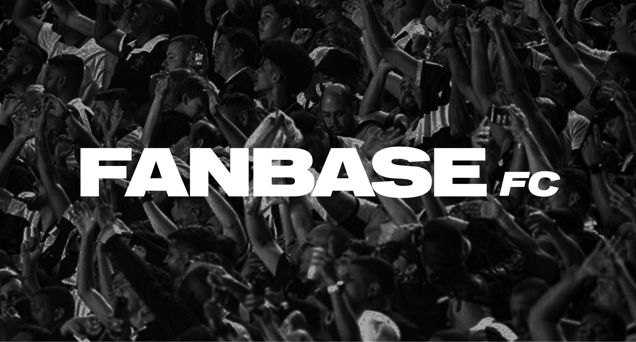
This brand was the product of Mikaela becoming a dedicated Arsenal fan and unexpectedly finding community in her local Arsenal bar during a particularly difficult period in her life.
“I’ve experienced the highs of the wins and the lows of the losses, a shared feeling amongst the people I’ve met that love this team. The community I’ve built through this fandom is one that can’t be described, but is held in my highest honor,” she shares. “This experience has reinvigorated my creativity and desire for community building which sparked the idea for Fanbase FC.”
Color Palette and Typograhy Selection
brand identity: color palette and typography selection
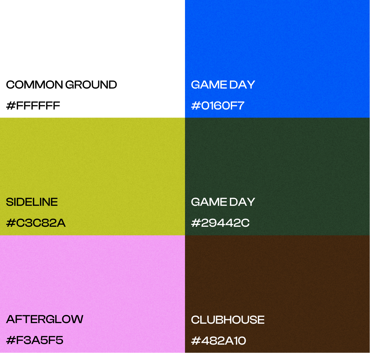
Bright colors capture the electricity of sport, the moments that ignite emotion, while greens and browns represent the fields, courts, and communities where those moments become something more.
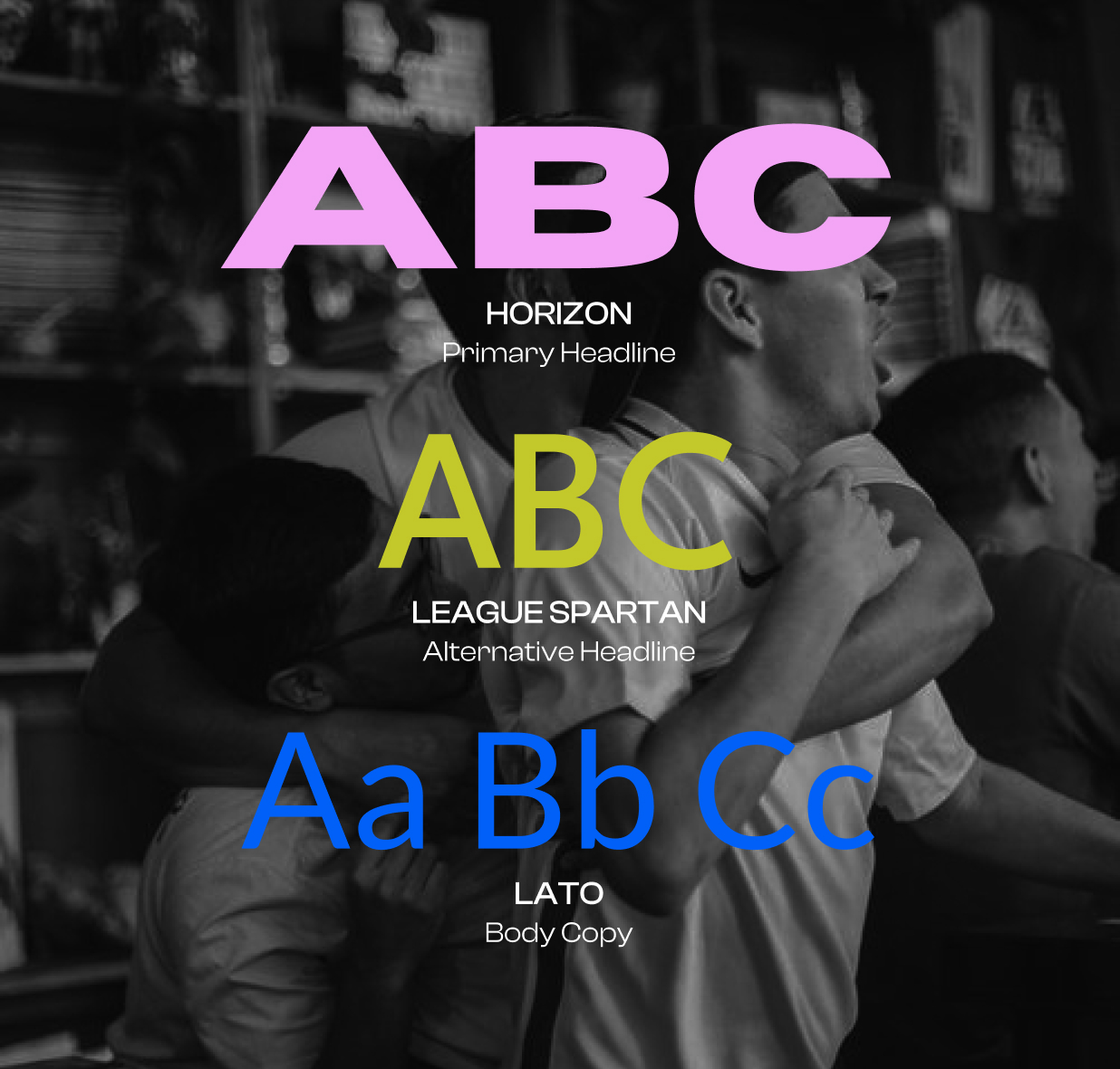
The typography blends varying weights and widths to reflect the rhythm of sports culture, balancing moments of intensity with moments of connection.

Brand Founder, Key Words, and Moodboard
creative direction
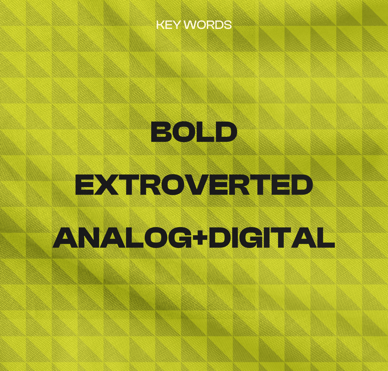
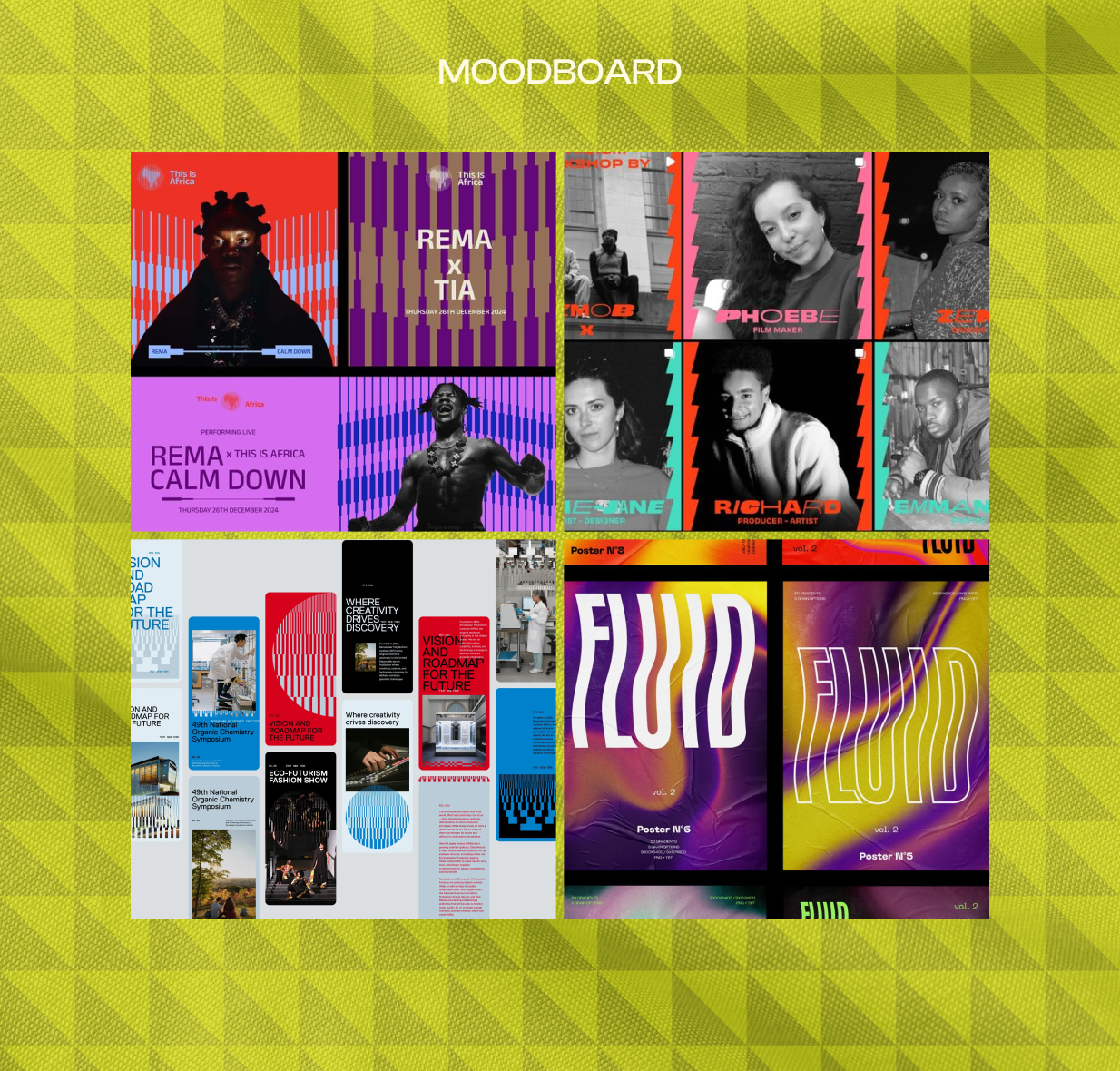
Our guiding key words were bold, extroverted, and analog and digital – and our intention was for the brand to reflect the eclectic mix of individuals that comprise sports communities, within soccer and beyond.
logo design
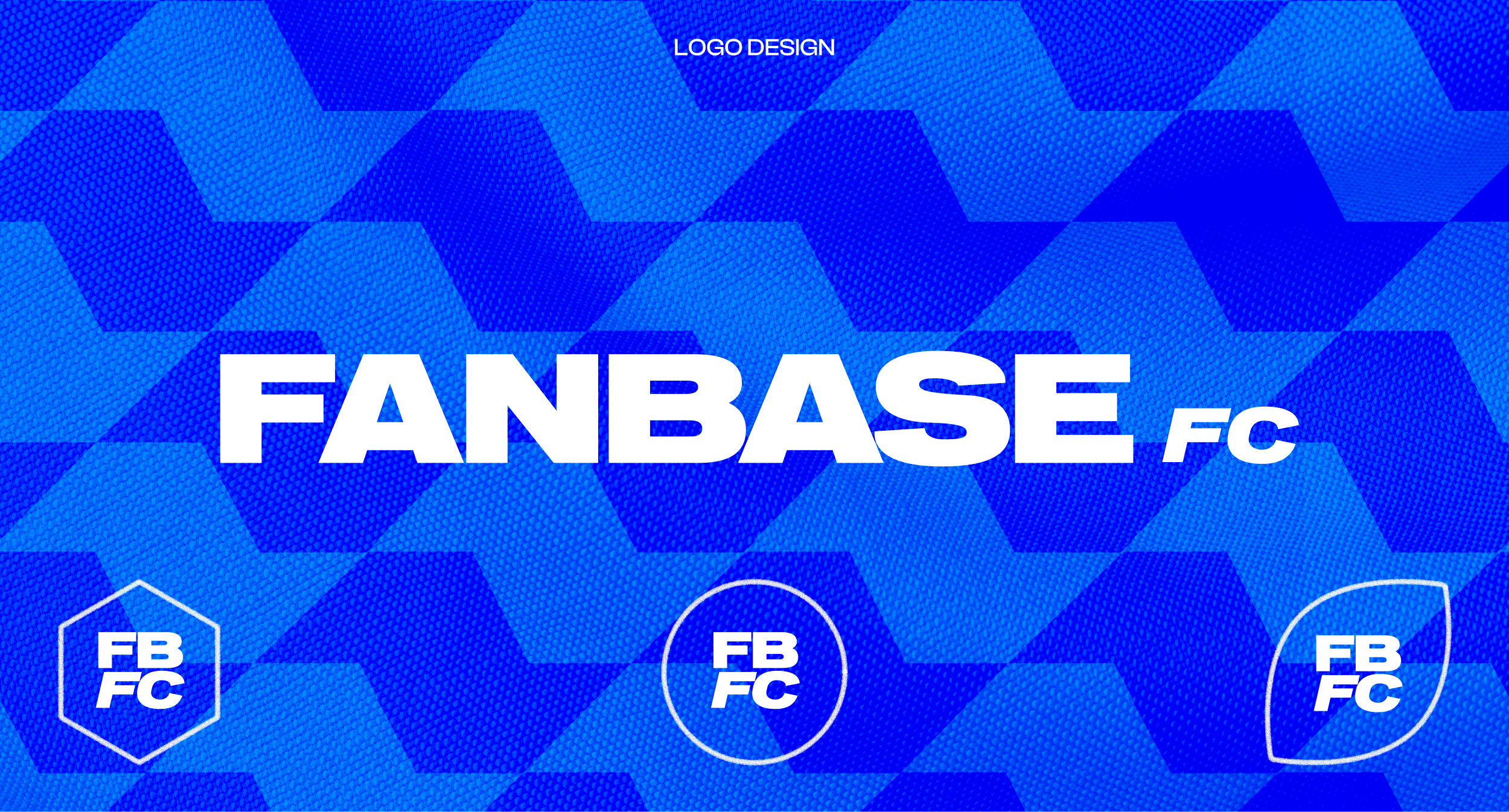
The logo is a clear nod to the Fanbase with the FC being a smaller, flexible element that has the ability to take on multiple meanings depending on setting (football club, fan club, etc).
The stacked brandmark fits into multiple shapes, once again nodding to the variety of sports intended to be covered.
graphic elements and instagram assets
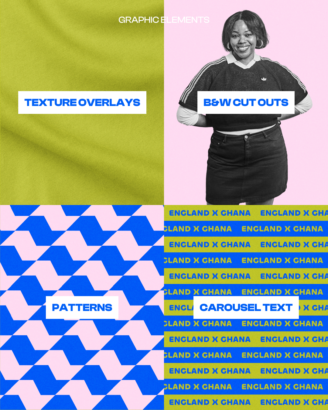
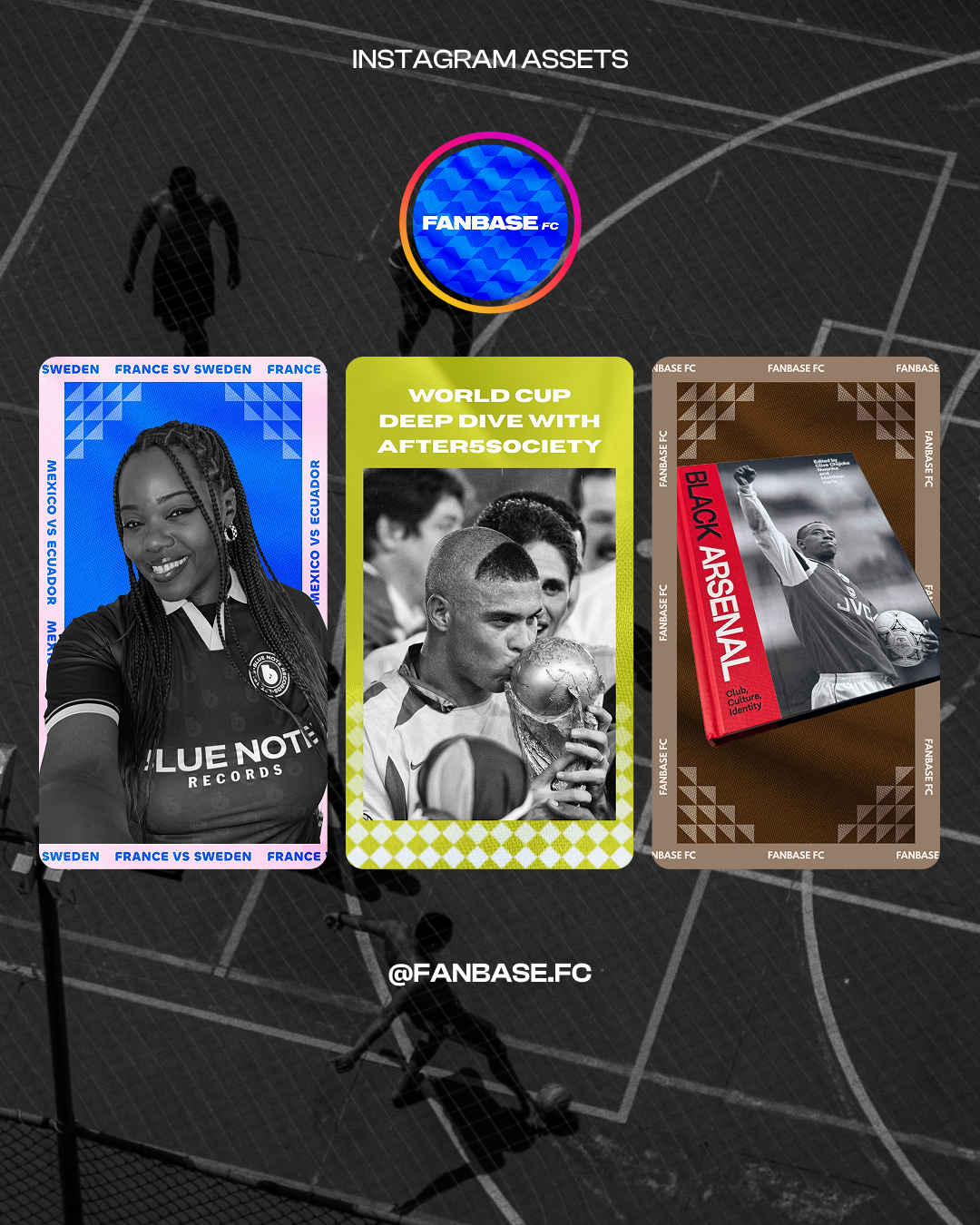
For graphic elements, I utilized subtle fabric overlays on asset backgrounds to reference jersey fabrics.
Dimensional, cut out imagery places emphasis on the subject at hand, while fun patterns create a sense of liveliness.
Carousel text reinforces the continuous nature of sports culture. While games have a beginning and an end, the conversations, traditions, and communities surrounding them are always in motion.
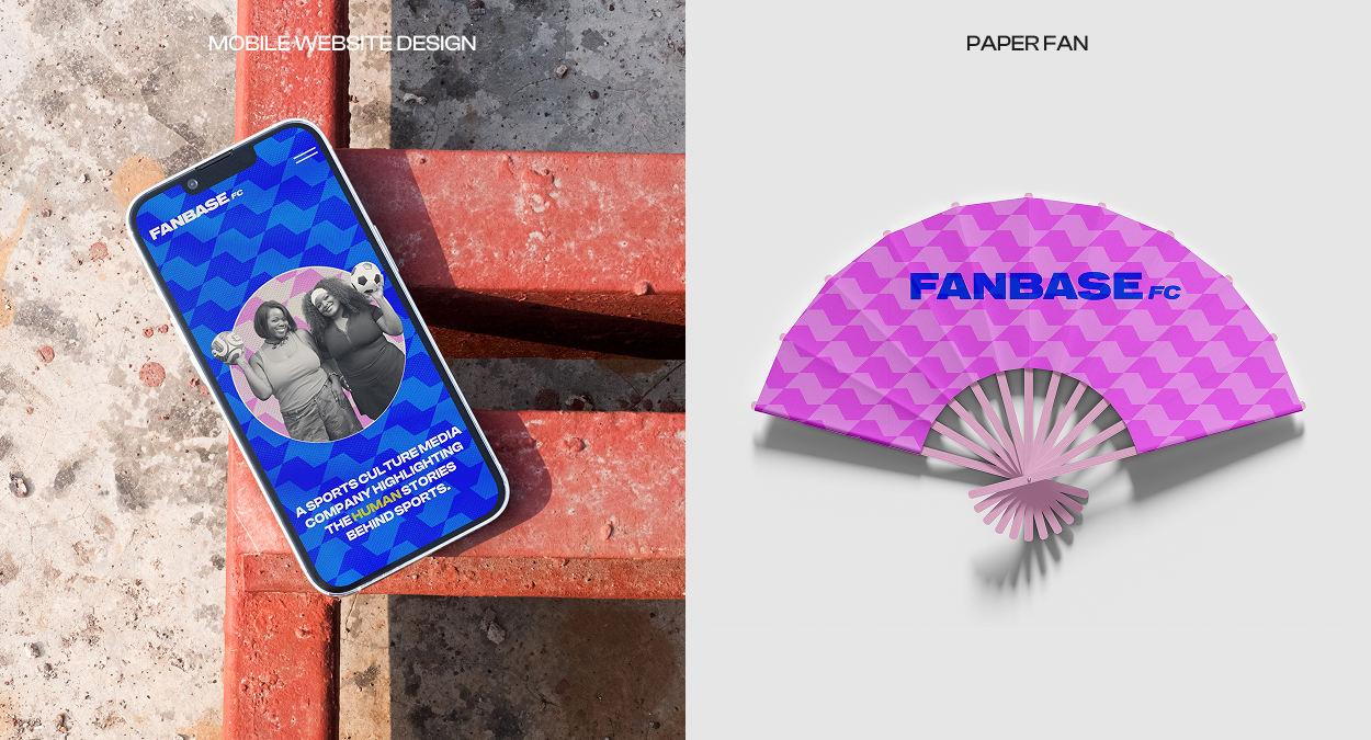
Logo, Graphic Elements, Instagram Design, and Mockups
conclusion
Designing Fanbase FC was an exercise in looking beyond the game itself. Every decision, from the color palette to the typography and motion system, was intended to express the culture surrounding sports: the moments, memories, and communities within it.
As the company expands into interviews, more original content, events, and partnerships, the identity provides a flexible foundation that can evolve alongside it while remaining rooted in the communities at the heart of sports.



i’d love to hear from you!
paleymartindesign@gmail.com
Case Study
fanbase fc
Fanbase FC is a Brooklyn, New York-based sports culture media company focused on storytelling, community building, and experiences that bring fans closer to the people, places, and traditions that makes sports meaningful.
“Sports are the entry point. Community, identity, culture, belonging, and experiences are the story,” says the brand’s founder, marketing professional and sports lover Mikaela Allen.
Branding
Creative Direction
Social Media Design
Digital Design
brand story
This brand was the product of Mikaela becoming a dedicated Arsenal fan and unexpectedly finding community in her local Arsenal bar during a particularly difficult period in her life.
“I’ve experienced the highs of the wins and the lows of the losses, a shared feeling amongst the people I’ve met that love this team. The community I’ve built through this fandom is one that can’t be described, but is held in my highest honor,” she shares. “This experience has reinvigorated my creativity and desire for community building which sparked the idea for Fanbase FC.”
Color Palette and Typograhy Selection
brand identity: color palette and typography selection
Bright colors capture the electricity of sport, the moments that ignite emotion, while greens and browns represent the fields, courts, and communities where those moments become something more.
The typography blends varying weights and widths to reflect the rhythm of sports culture, balancing moments of intensity with moments of connection.
Brand Founder, Key Words, and Moodboard
creative direction
Our guiding key words were bold, extroverted, and analog and digital – and our intention was for the brand to reflect the eclectic mix of individuals that comprise sports communities, within soccer and beyond.
logo design
The logo is a clear nod to the Fanbase with the FC being a smaller, flexible element that has the ability to take on multiple meanings depending on setting (football club, fan club, etc).
The stacked brandmark fits into multiple shapes, once again nodding to the variety of sports intended to be covered.
graphic elements and instagram assets
For graphic elements, I utilized subtle fabric overlays on asset backgrounds to reference jersey fabrics.
Dimensional, cut out imagery places emphasis on the subject at hand, while fun patterns create a sense of liveliness.
Carousel text reinforces the continuous nature of sports culture. While games have a beginning and an end, the conversations, traditions, and communities surrounding them are always in motion.
Logo, Graphic Elements, Instagram Design, and Mockups
conclusion
Designing Fanbase FC was an exercise in looking beyond the game itself. Every decision, from the color palette to the typography and motion system, was intended to express the culture surrounding sports: the moments, memories, and communities within it.
As the company expands into interviews, more original content, events, and partnerships, the identity provides a flexible foundation that can evolve alongside it while remaining rooted in the communities at the heart of sports.

i’d love to hear from you!
paleymartindesign@gmail.comCase Study
fanbase fc
Fanbase FC is a Brooklyn, New York-based sports culture media company focused on storytelling, community building, and experiences that bring fans closer to the people, places, and traditions that makes sports meaningful.
Founder Mikaela Allen had the idea in place, but needed a designer to bring her brand to life. We worked together to create a visual language that felt both analog and digital, trendy and timeless, and just as vibrant and eclectic as the fans behind the sport.
Branding
Creative Direction
Social Media Design
Digital Design
brand story
This brand was the product of Mikaela becoming a dedicated Arsenal fan and unexpectedly finding community in her local Arsenal bar during a particularly difficult period in her life.
“I’ve experienced the highs of the wins and the lows of the losses, a shared feeling amongst the people I’ve met that love this team. The community I’ve built through this fandom is one that can’t be described, but is held in my highest honor,” she shares. “This experience has reinvigorated my creativity and desire for community building which sparked the idea for Fanbase FC.”
Color Palette and Typograhy Selection
brand identity: color palette and typography selection
Bright colors capture the electricity of sport, the moments that ignite emotion, while greens and browns represent the fields, courts, and communities where those moments become something more.
The typography blends varying weights and widths to reflect the rhythm of sports culture, balancing moments of intensity with moments of connection.
Brand Founder, Key Words, and Moodboard
creative direction
Our guiding key words were bold, extroverted, and analog and digital – and our intention was for the brand to reflect the eclectic mix of individuals that comprise sports communities, within soccer and beyond.
logo design
The logo is a clear nod to the Fanbase with the FC being a smaller, flexible element that has the ability to take on multiple meanings depending on setting (football club, fan club, etc).
The stacked brandmark fits into multiple shapes, once again nodding to the variety of sports intended to be covered.
graphic elements and instagram assets
For graphic elements, I utilized subtle fabric overlays on asset backgrounds to reference jersey fabrics.
Dimensional, cut out imagery places emphasis on the subject at hand, while fun patterns create a sense of liveliness.
Carousel text reinforces the continuous nature of sports culture. While games have a beginning and an end, the conversations, traditions, and communities surrounding them are always in motion.
Logo, Graphic Elements, Instagram Design, and Mockups
conclusion
Designing Fanbase FC was an exercise in looking beyond the game itself. Every decision, from the color palette to the typography and motion system, was intended to express the culture surrounding sports: the moments, memories, and communities within it.
As the company expands into interviews, more original content, events, and partnerships, the identity provides a flexible foundation that can evolve alongside it while remaining rooted in the communities at the heart of sports.

i’d love to hear from you!
paleymartindesign@gmail.com