Case Study
paley jean art
I created the Tennis Baddie series for my art brand, Paley Jean. The series, which is currently partially live, is designed for tennis playing women who want to show off their love of the sport. A mini collection of prints, a tote, tee, baseball cap, and sticker, the vibrant and cheeky series offers an alternative to the sport's stereotypical country club reputation.
Branding
Illustration
Creative Direction
Color Palette and Typography Selection
branding
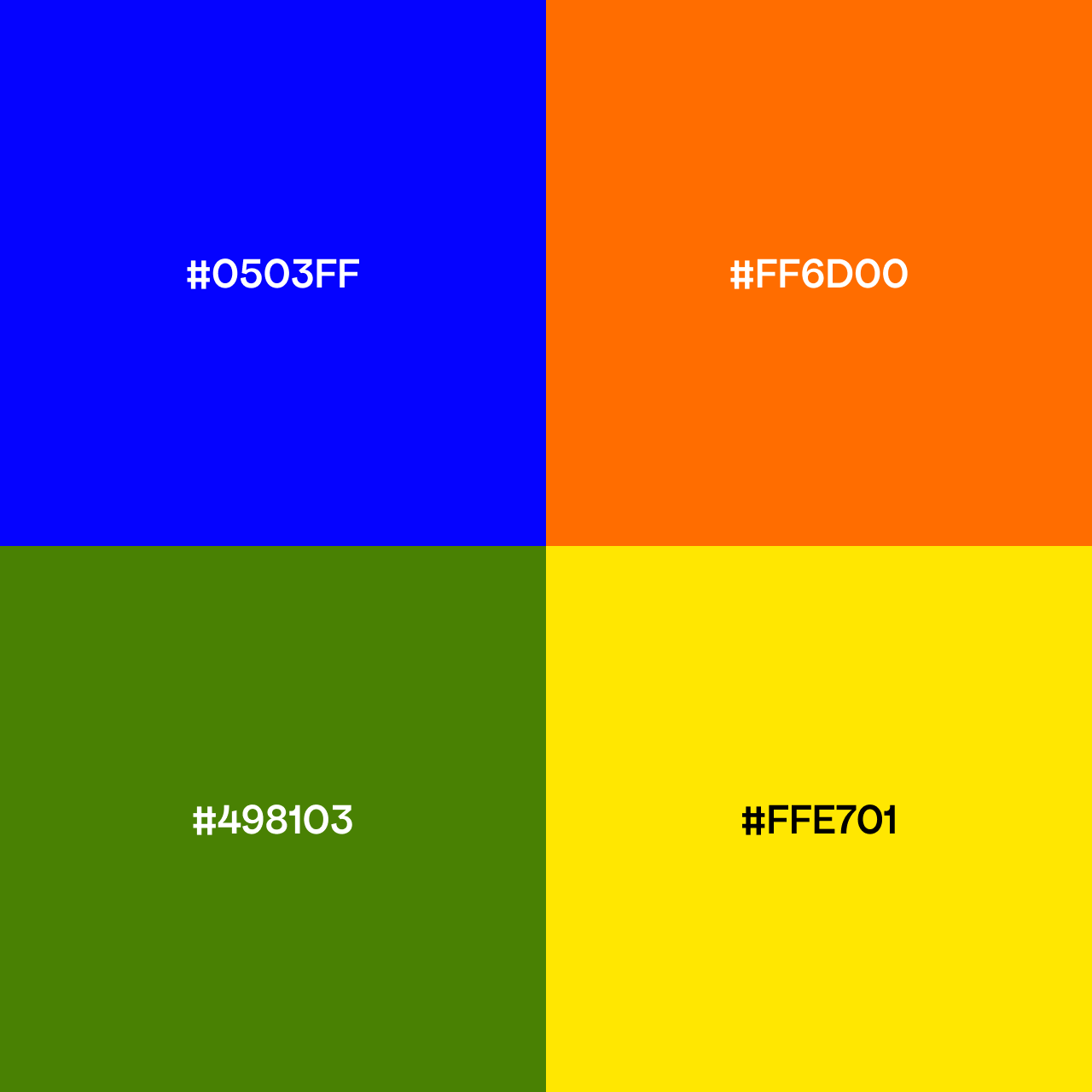
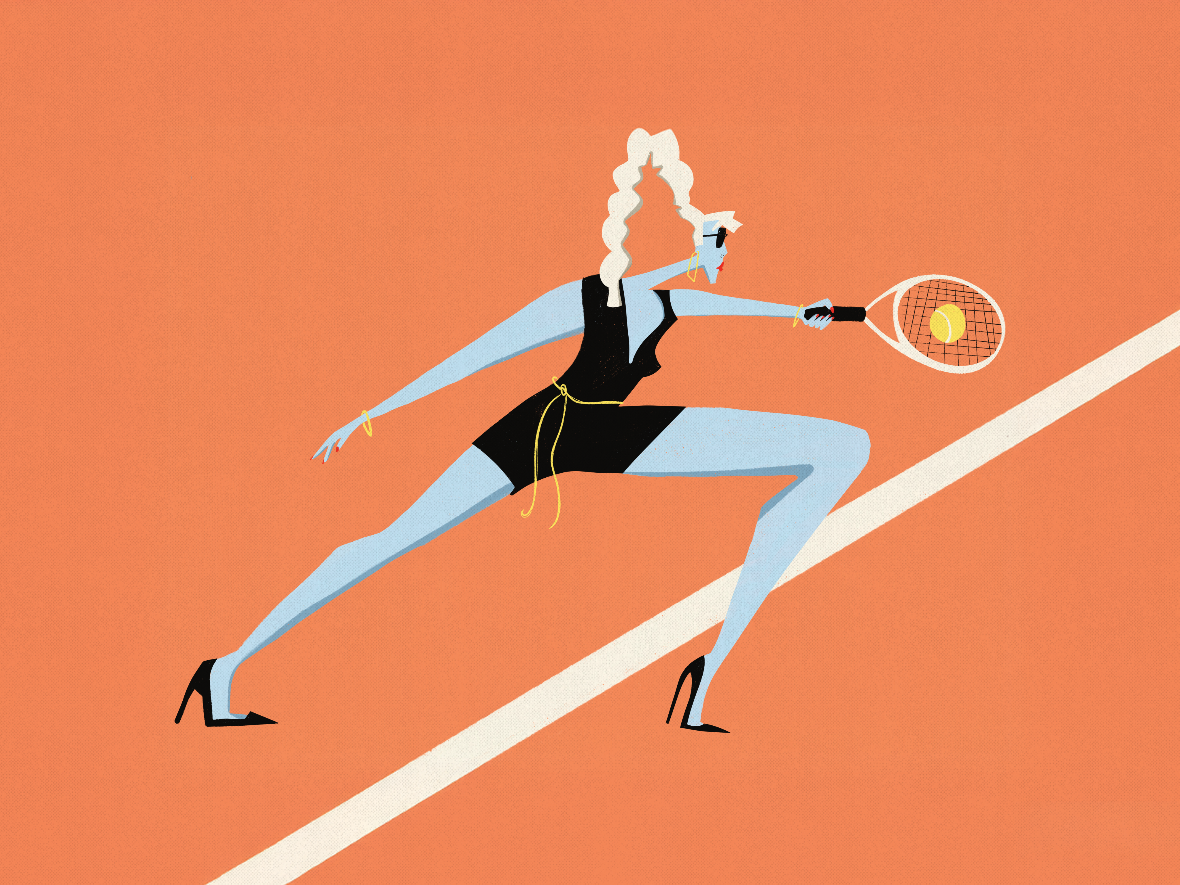
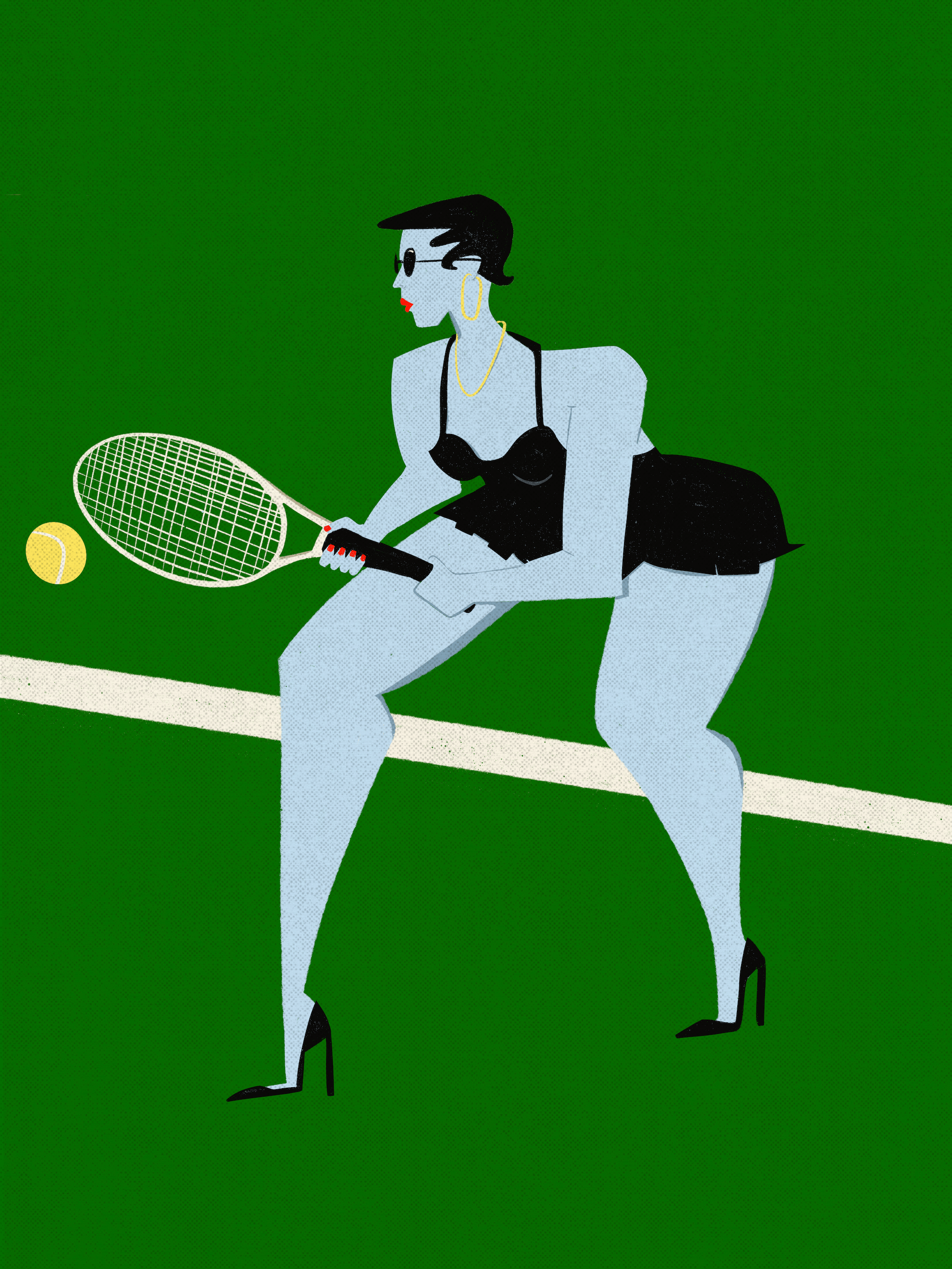
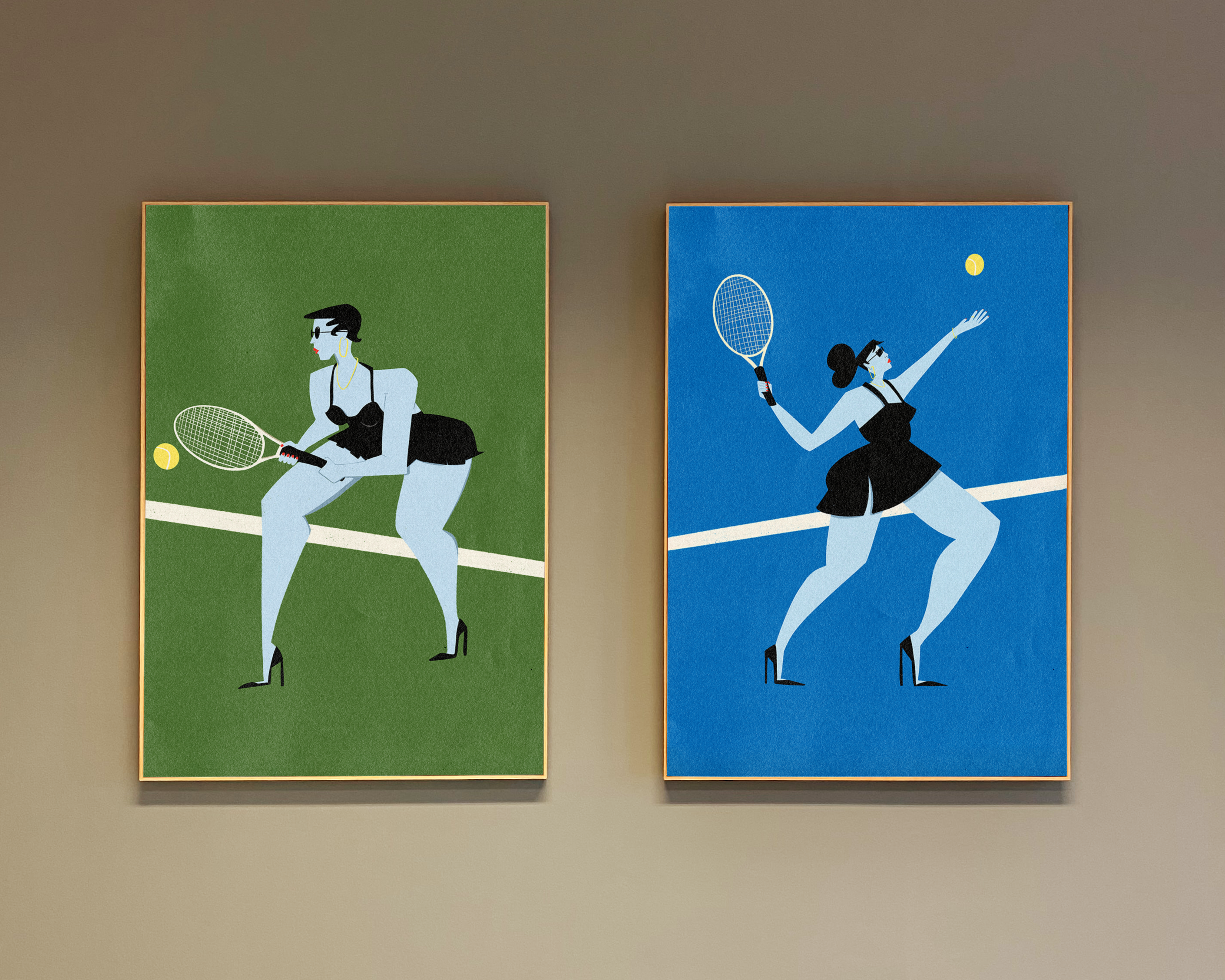
The Tennis Baddie color palette is an ode to the different types of courts: blue for hard courts, orange for clay, and green for grass. The yellow represents the tennis ball, which is present in the prints.
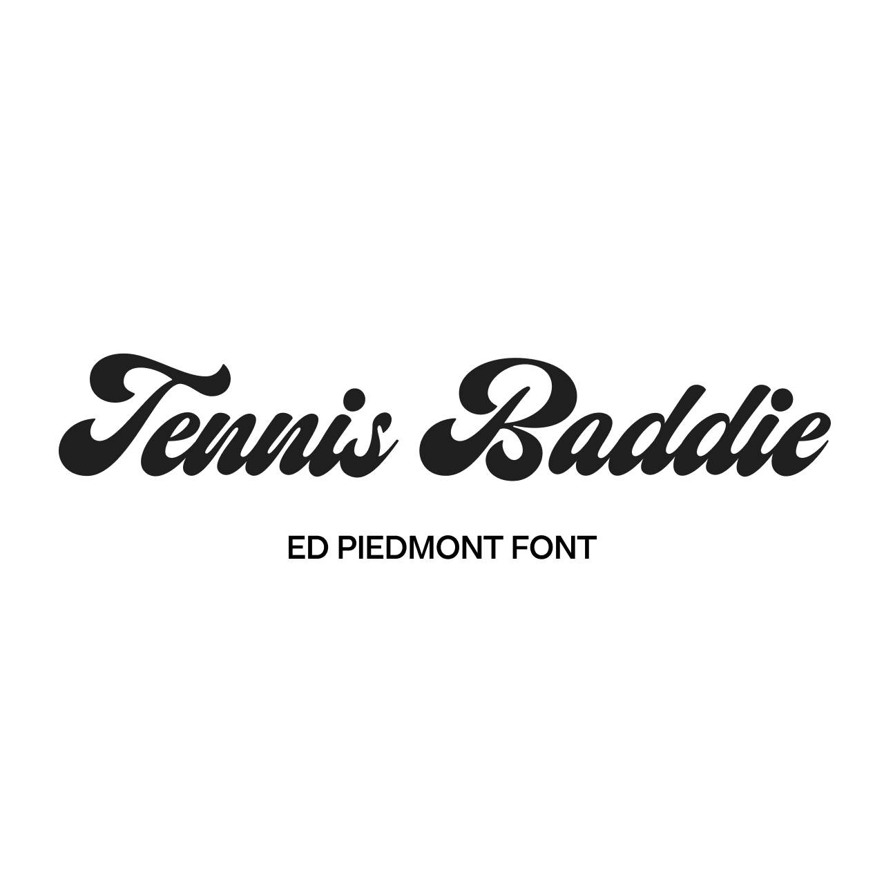
For typography, I used Emyself Design's ED Piedmont font, which blends a retro look with contemporary, crisp letterforms and an overall playful, feminine feel.
Art Prints
illustrations
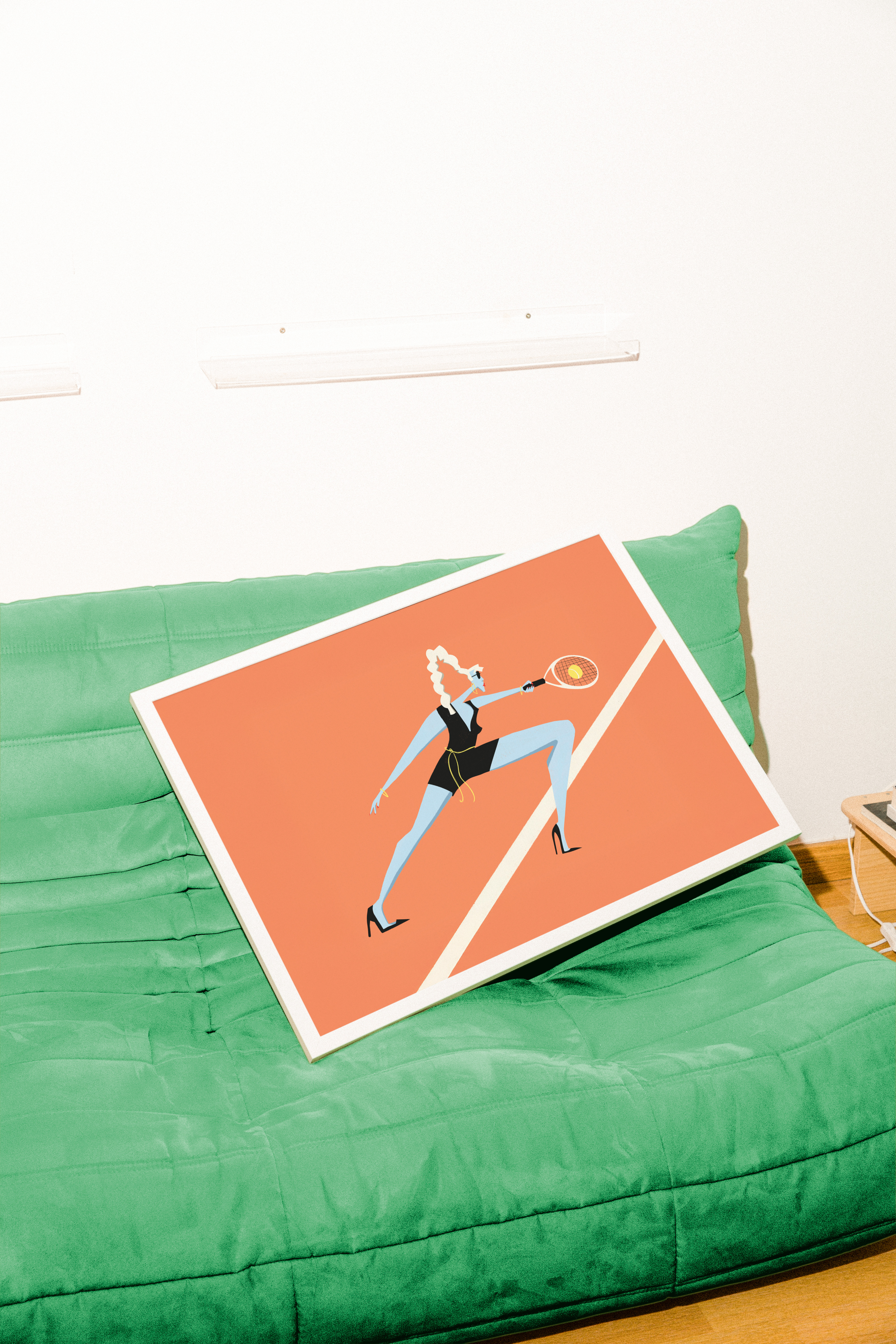
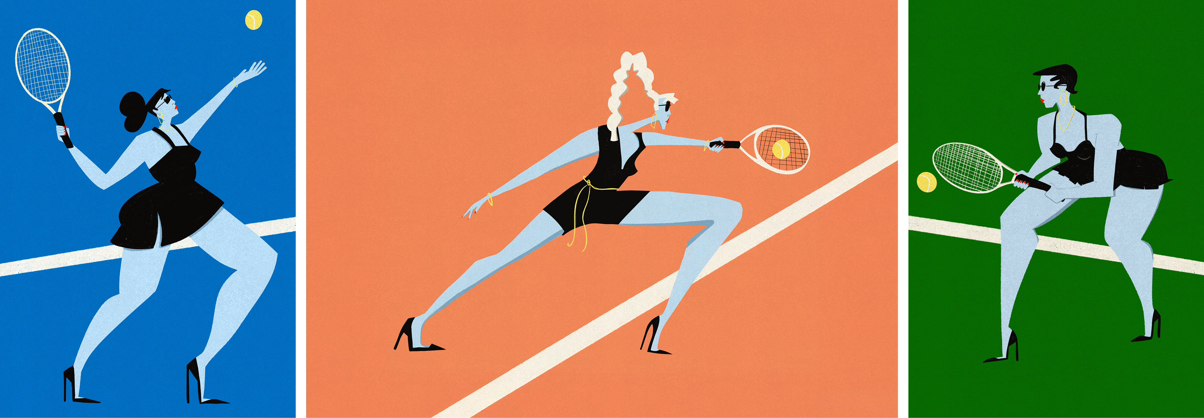
For my illustrations, I put a twist on one of the sport's main draws: the fashion. I drew women wearing stilettos in black fitted outfits, adorned with gold jewelry. Each woman has her own sense of style, but they’re all united in their blue skin, black fits, and pumps
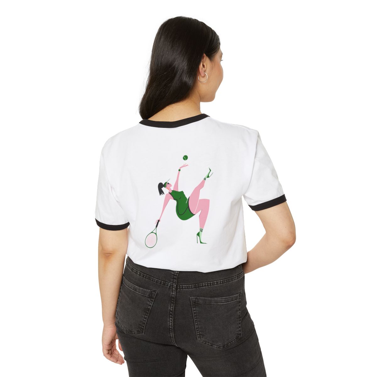
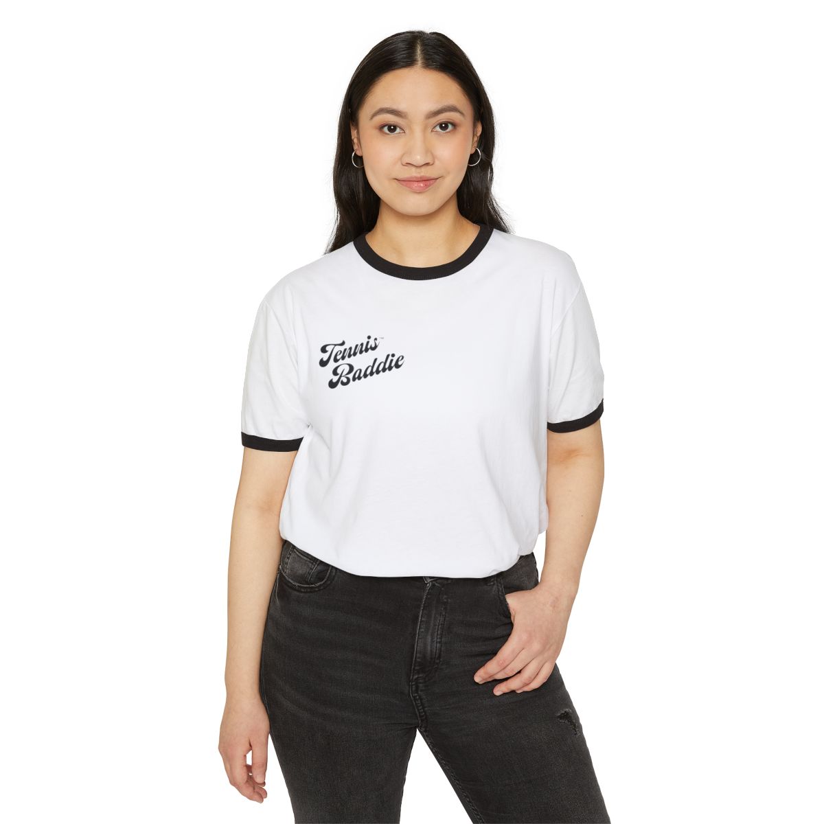
Baseball Cap and Ringer Tee
creative direction
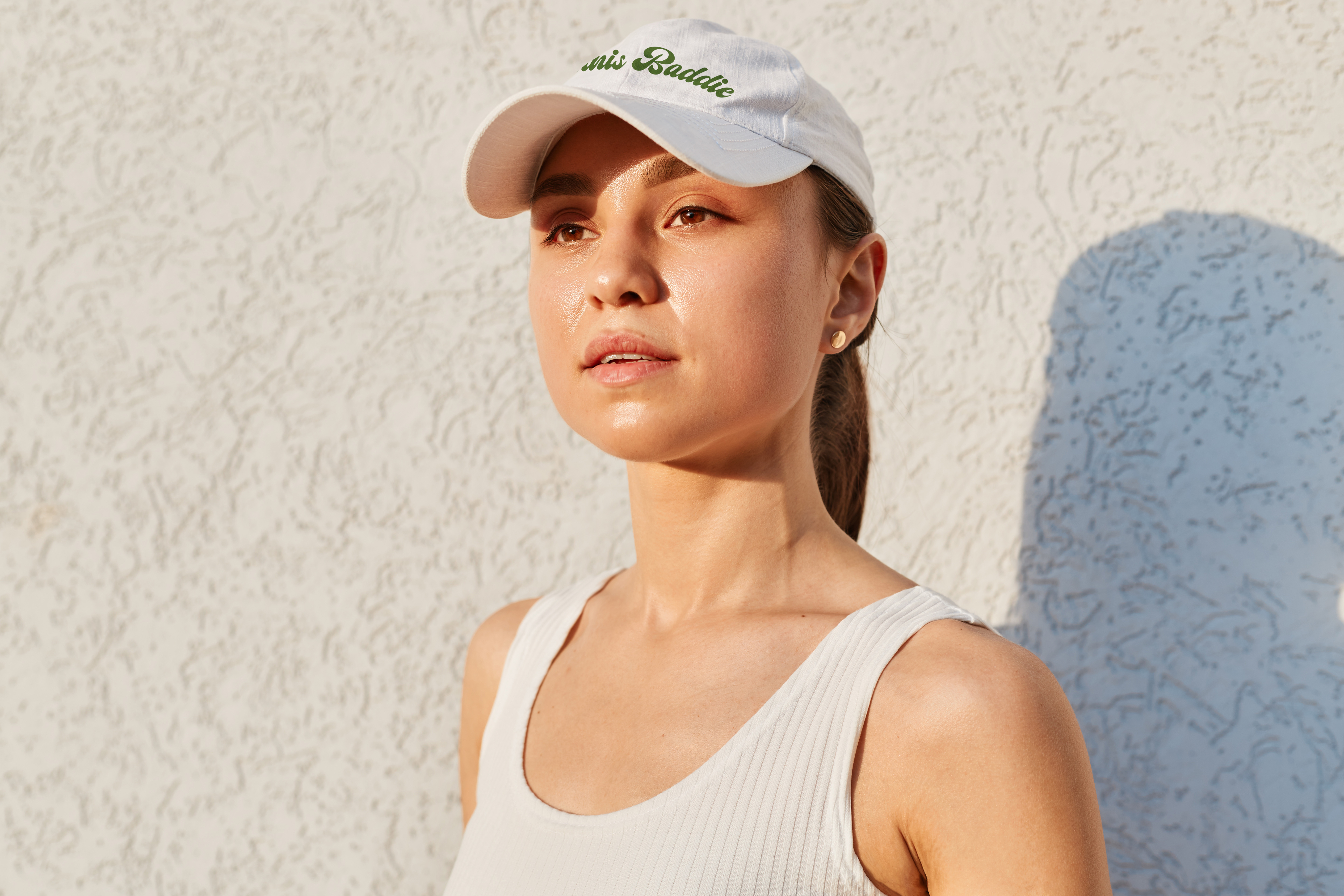
The series is a small capsule collection intended for every day use. I elected to feature the “Baddie” archetype only on the tee, tote, and prints, while the baseball cap and sticker feature the Tennis Baddie lockup without illustration.
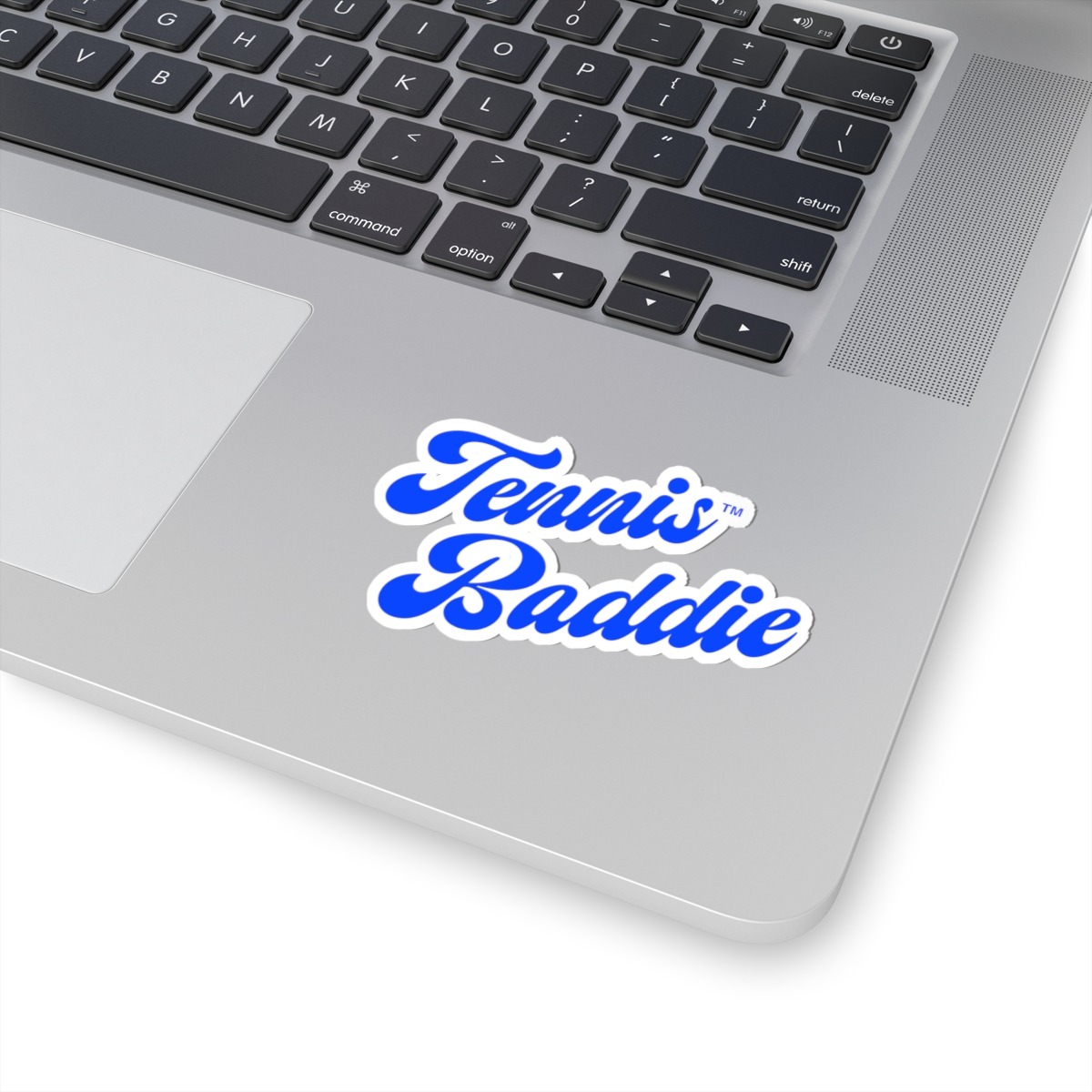
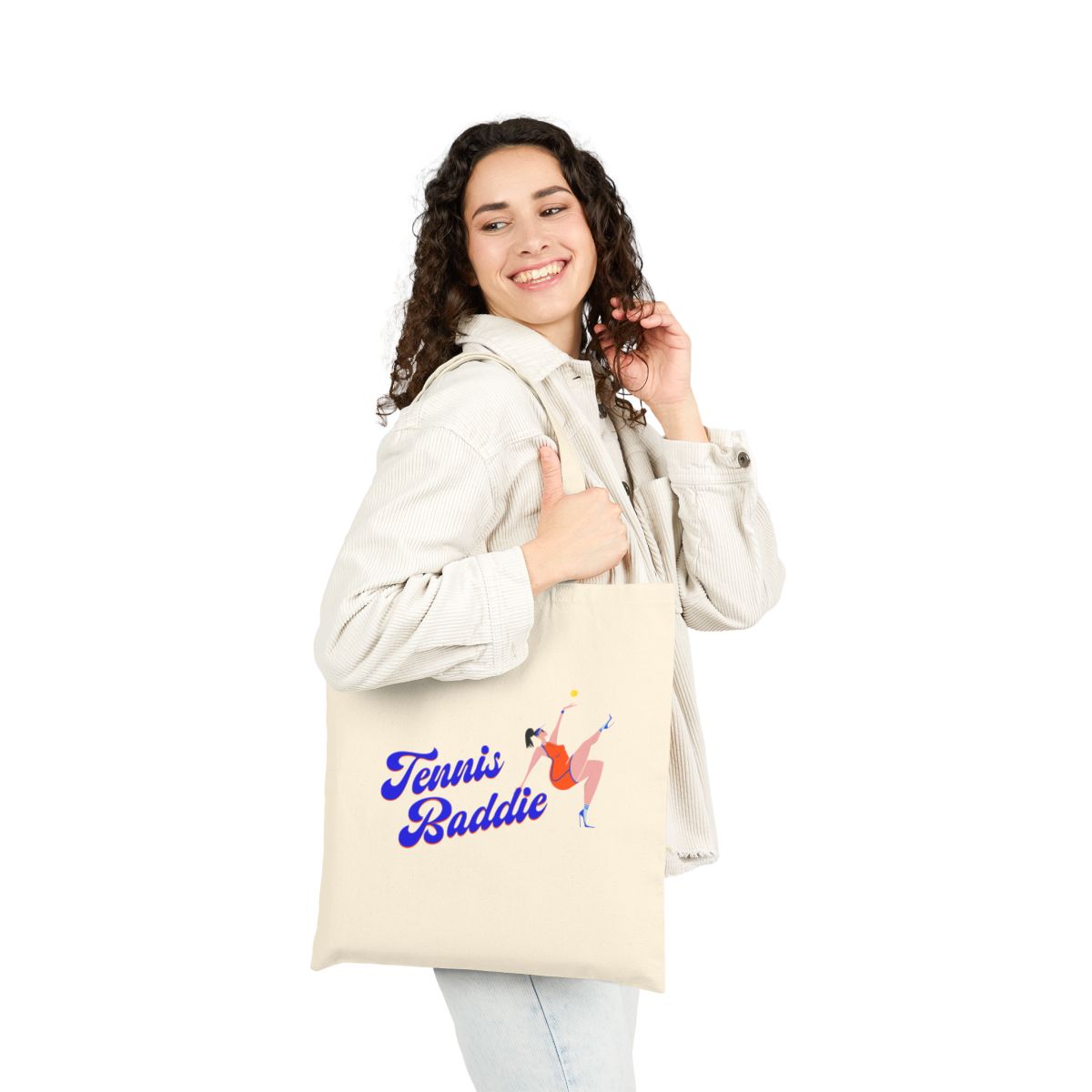
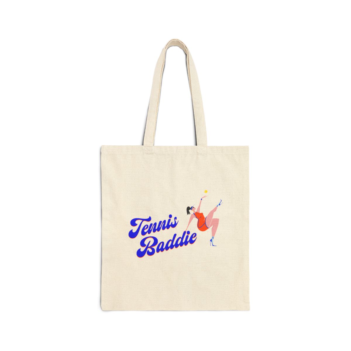
Sticker and Tote
conclusion
From its tone of voice to its visual identity, the brand brings past and present together, celebrating the rich history of the sport, the sense of community it fosters, and the women who shape it.

i’d love to hear from you!
paleymartindesign@gmail.com
Case Study
paley jean art
I created the Tennis Baddie series for my art brand, Paley Jean. The series, which is currently partially live, is designed for tennis playing women who want to show off their love of the sport. A mini collection of prints, a tote, tee, baseball cap, and sticker, the vibrant and cheeky series offers an alternative to the sport's stereotypical country club reputation.
Branding
Illustration
Creative Direction
Color Palette and Typography Selection
branding
The Tennis Baddie color palette is an ode to the different types of courts: blue for hard courts, orange for clay, and green for grass. The yellow represents the tennis ball, which is present in the prints.
For typography, I used Emyself Design's ED Piedmont font, which blends a retro look with contemporary, crisp letterforms and an overall playful, feminine feel.
Art Prints
illustrations
For my illustrations, I put a twist on one of the sport's main draws: the fashion. I drew women wearing stilettos in black fitted outfits, adorned with gold jewelry. Each woman has her own sense of style, but they’re all united in their blue skin, black fits, and pumps
creative direction
The series is a small capsule collection intended for every day use. I elected to feature the “Baddie” archetype only on the tee, tote, and prints, while the baseball cap and sticker feature the Tennis Baddie lockup without illustration.
Baseball Cap and Ringer Tee
Sticker and Tote
conclusion
From its tone of voice to its visual identity, the brand brings past and present together, celebrating the rich history of the sport, the sense of community it fosters, and the women who shape it.

i’d love to hear from you!
paleymartindesign@gmail.comCase Study
paley jean art
I created the Tennis Baddie series for my art brand, Paley Jean. The series, which is currently partially live, is designed for tennis playing women who want to show off their love of the sport. A mini collection of prints, a tote, tee, baseball cap, and sticker, the vibrant and cheeky series offers an alternative to the sport's stereotypical country club reputation.
Branding
Illustration
Creative Direction
Color Palette and Typography Selection
branding
The Tennis Baddie color palette is an ode to the different types of courts: blue for hard courts, orange for clay, and green for grass. The yellow represents the tennis ball, which is present in the prints.
For typography, I used Emyself Design's ED Piedmont font, which blends a retro look with contemporary, crisp letterforms and an overall playful, feminine feel.
Art Prints
illustrations
For my illustrations, I put a twist on one of the sport's main draws: the fashion. Each woman has her own sense of style, but they are unified with stilettos, black outfits, blue skin, and gold jewelry.
Baseball Cap and Ringer Tee
creative direction
The series is a small capsule collection intended for every day use. I elected to feature the “Baddie” archetype only on the tee, tote, and prints, while the baseball cap and sticker feature the Tennis Baddie lockup without illustration.
Sticker and Tote
conclusion
From its tone of voice to its visual identity, the brand brings past and present together, celebrating the rich history of the sport, the sense of community it fosters, and the women who shape it.

i’d love to hear from you!
paleymartindesign@gmail.com